 Tap to view full image
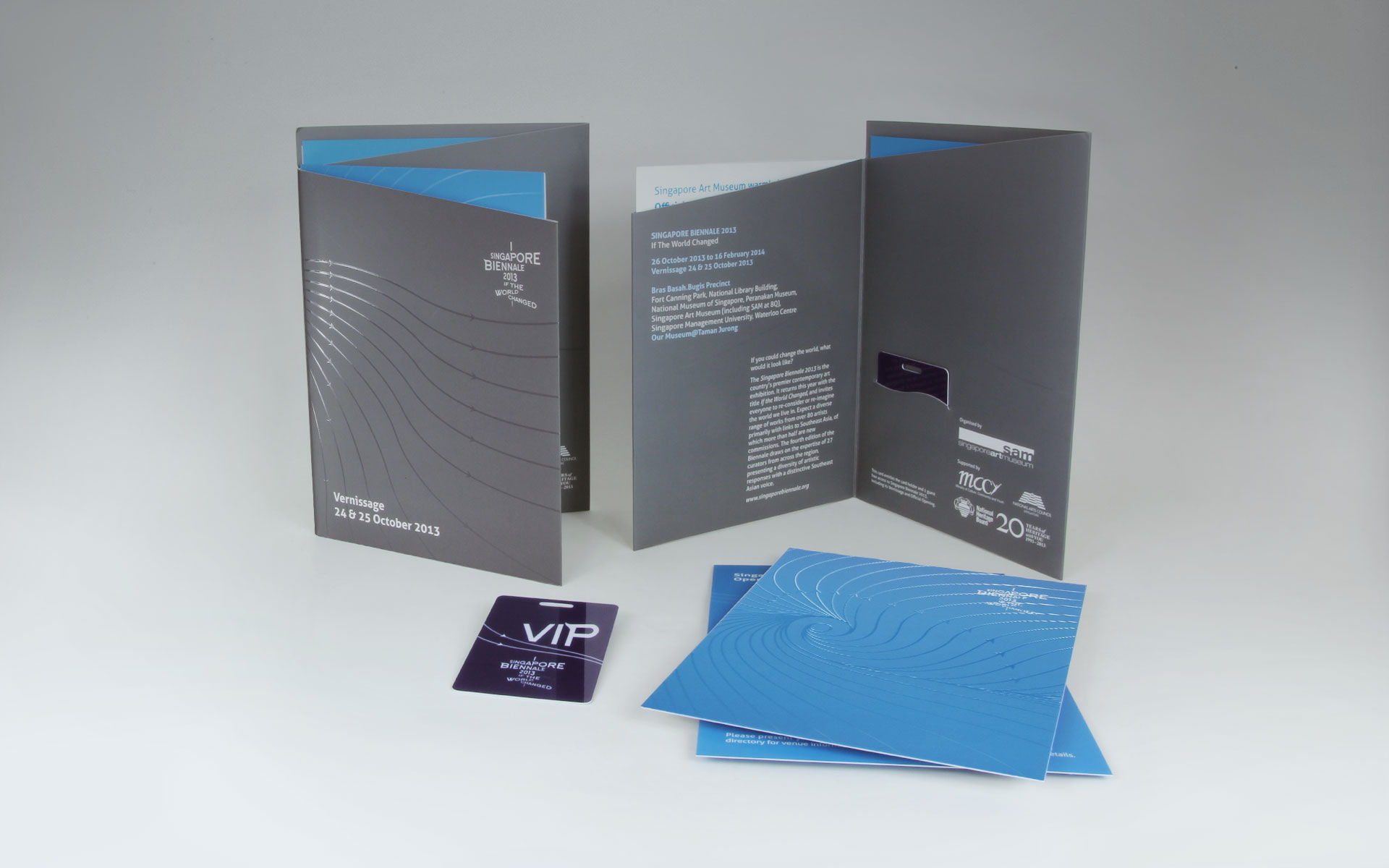
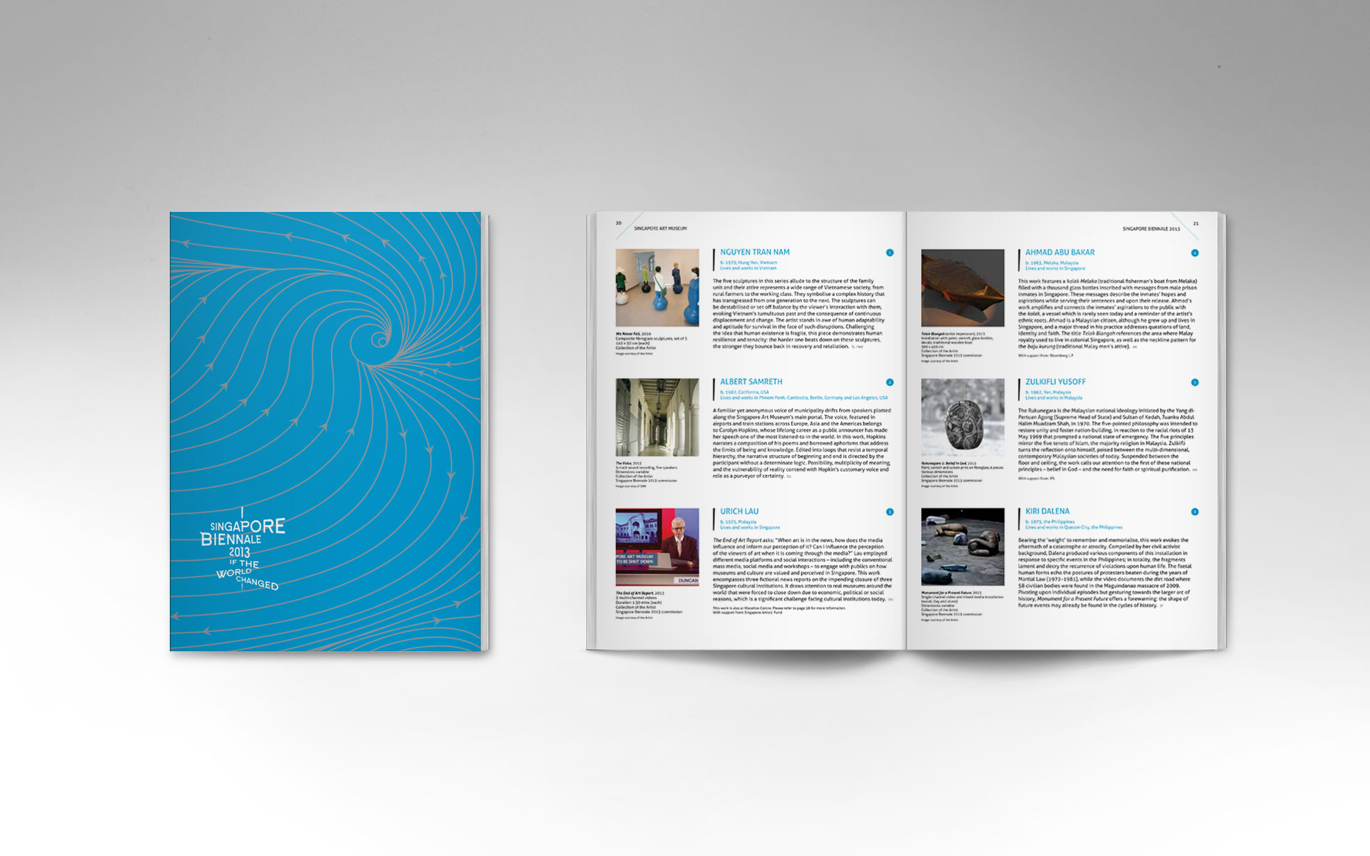
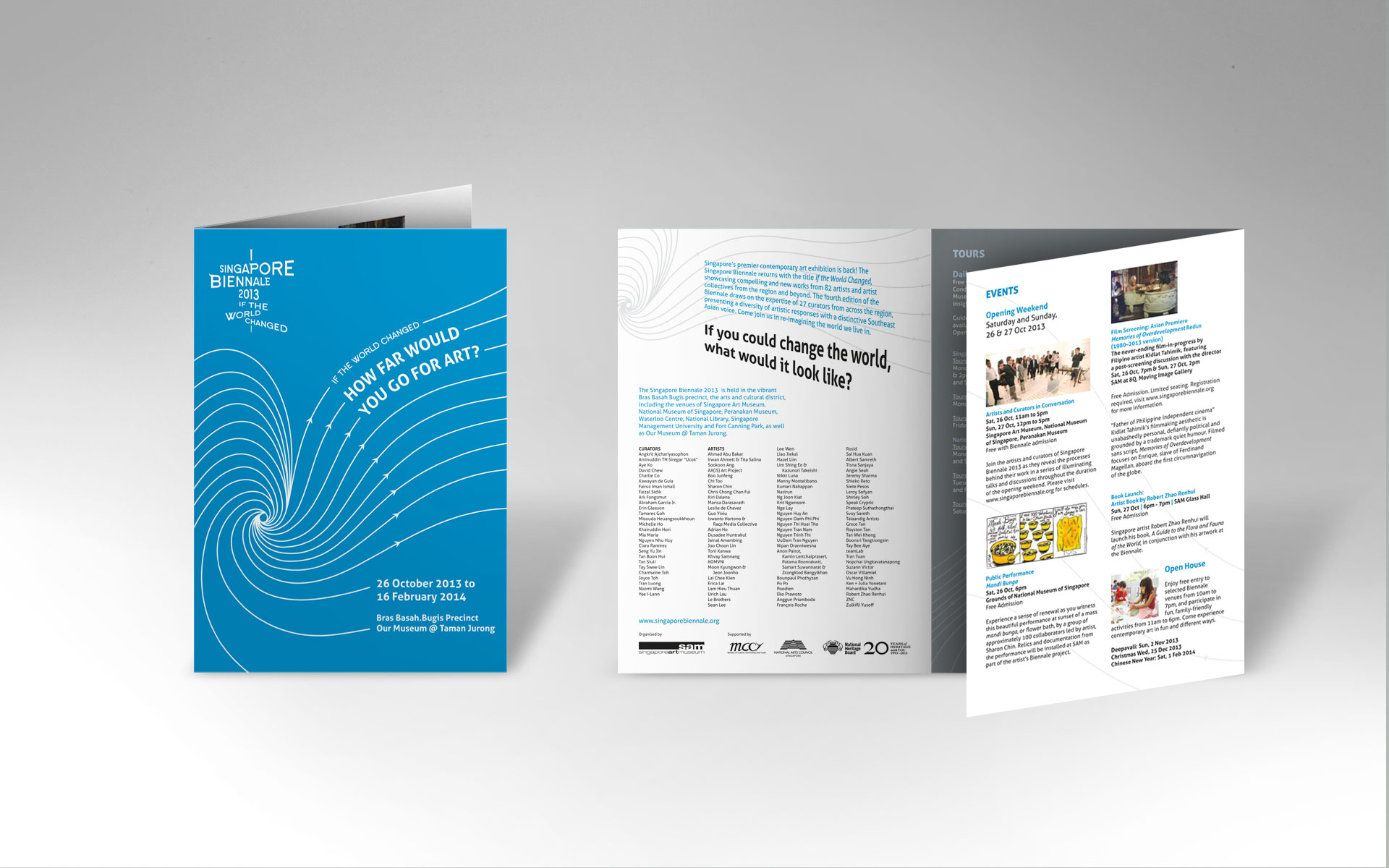
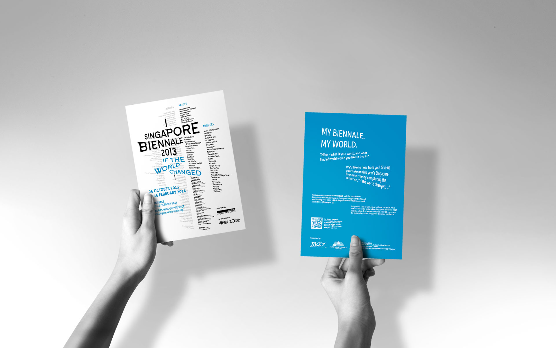
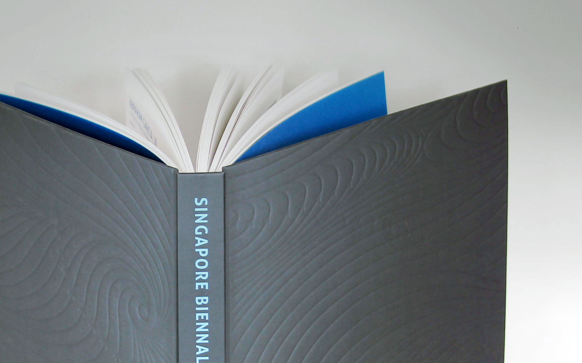
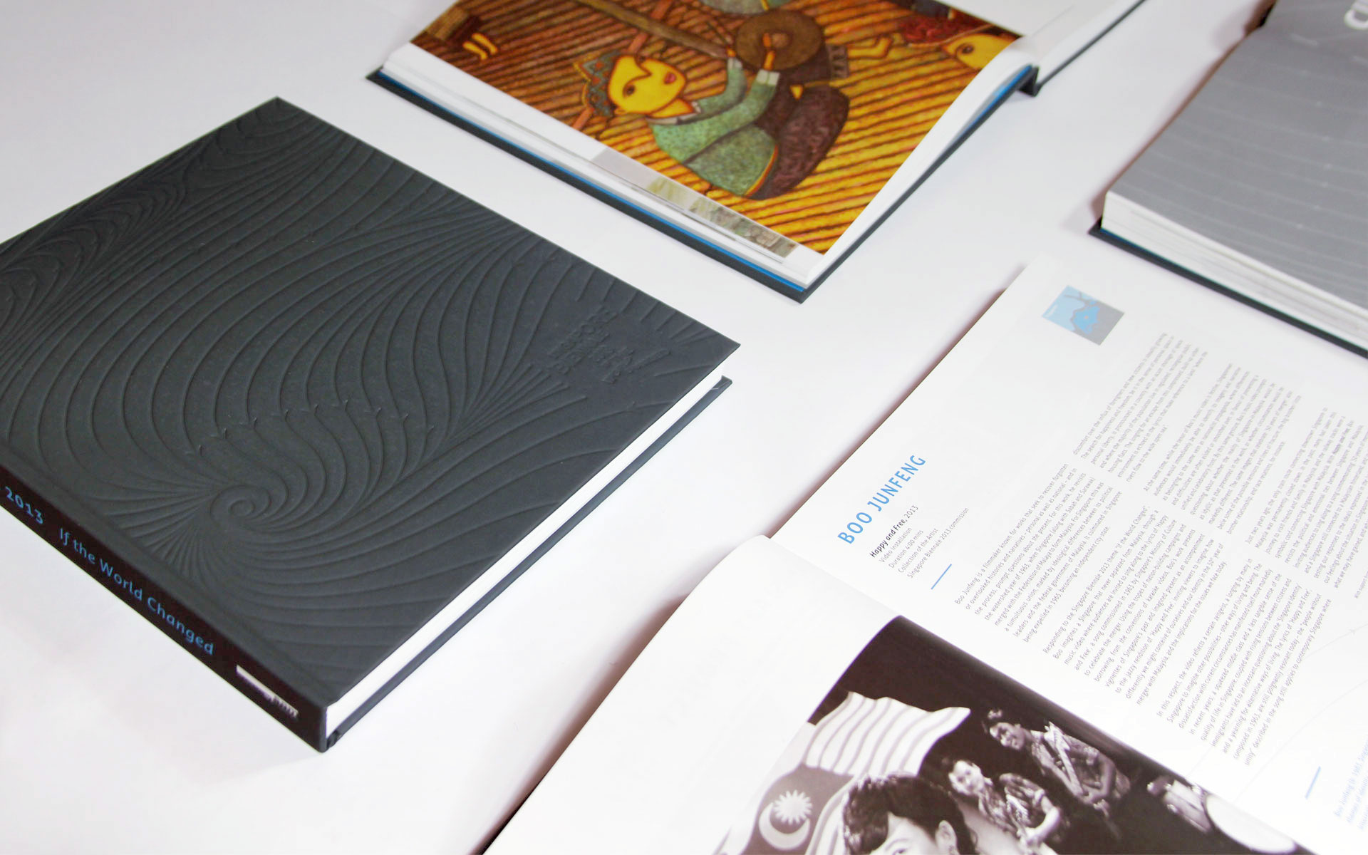
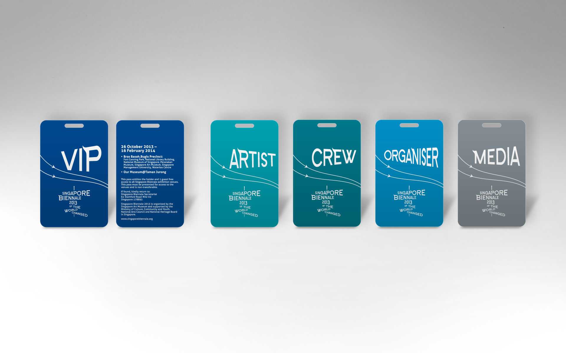
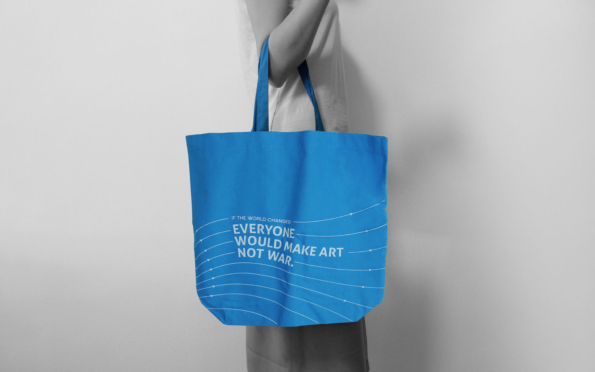
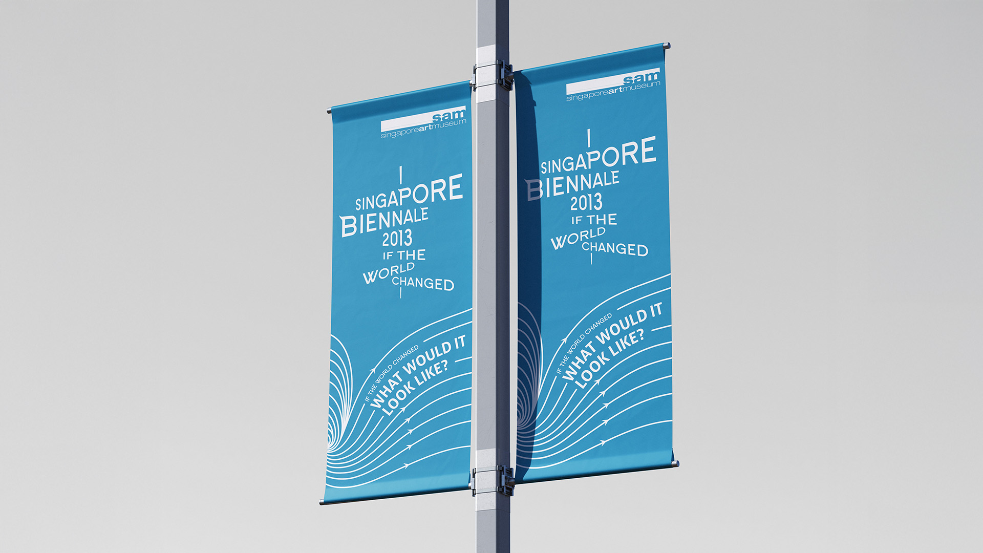
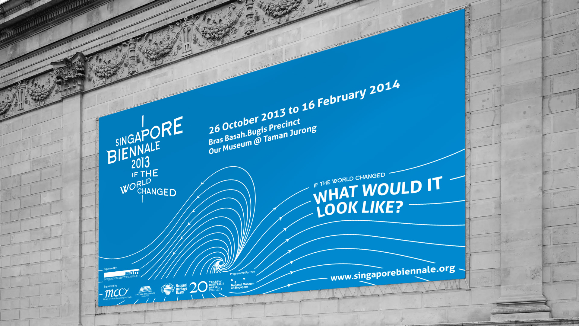
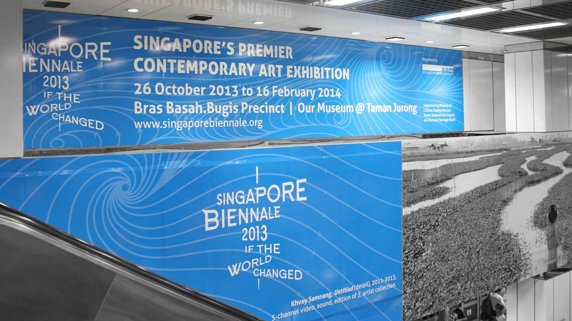
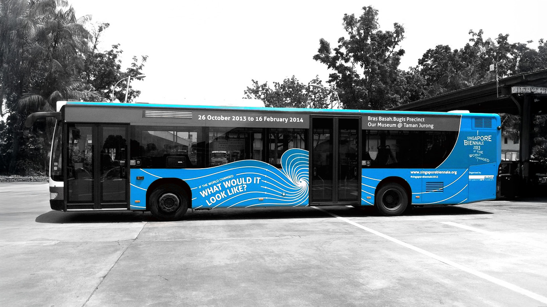
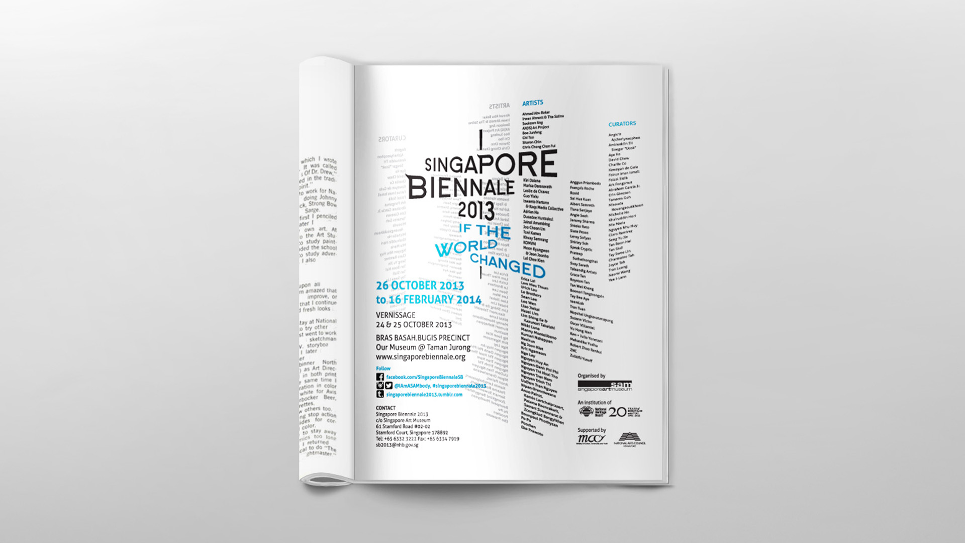
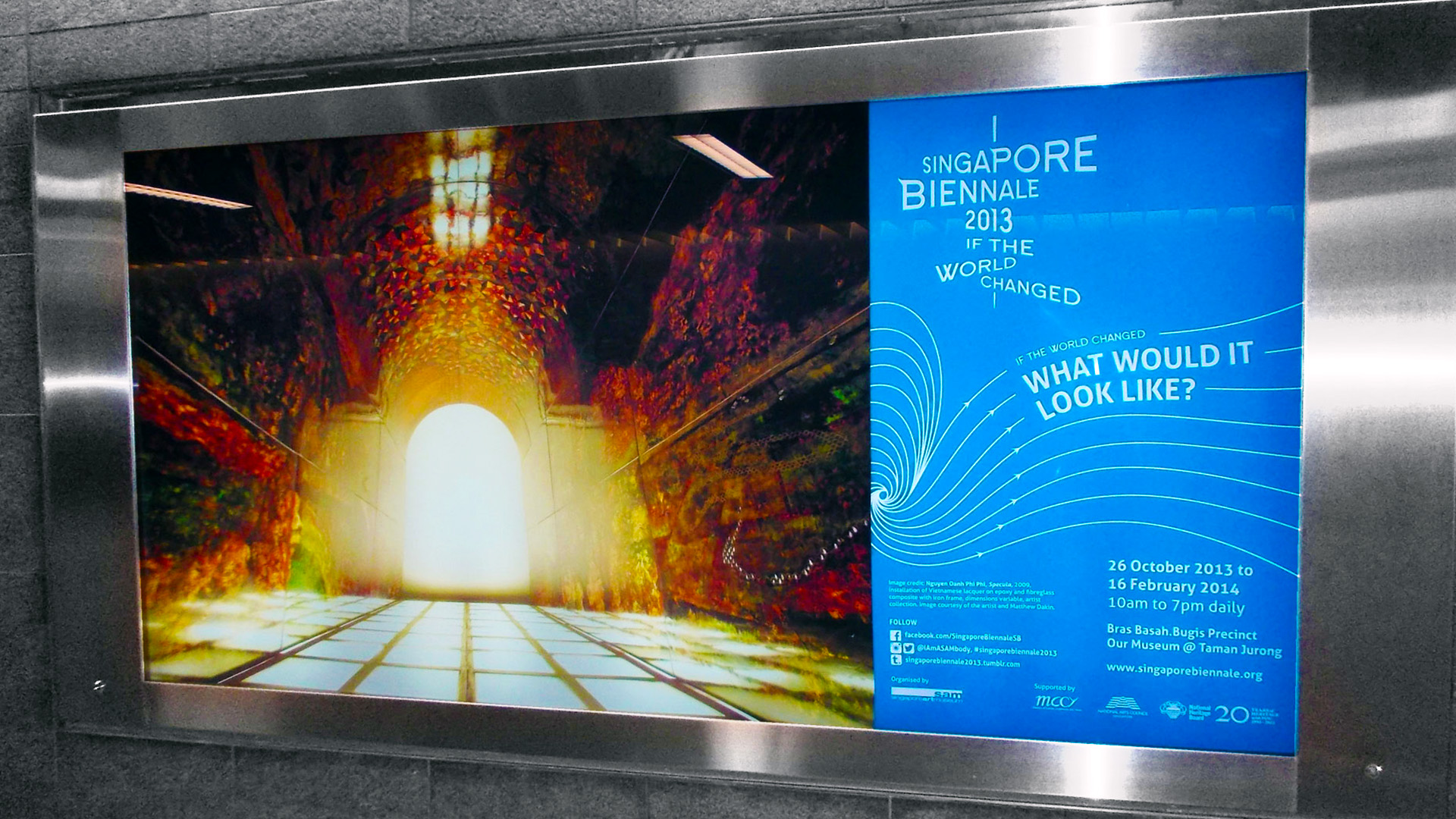
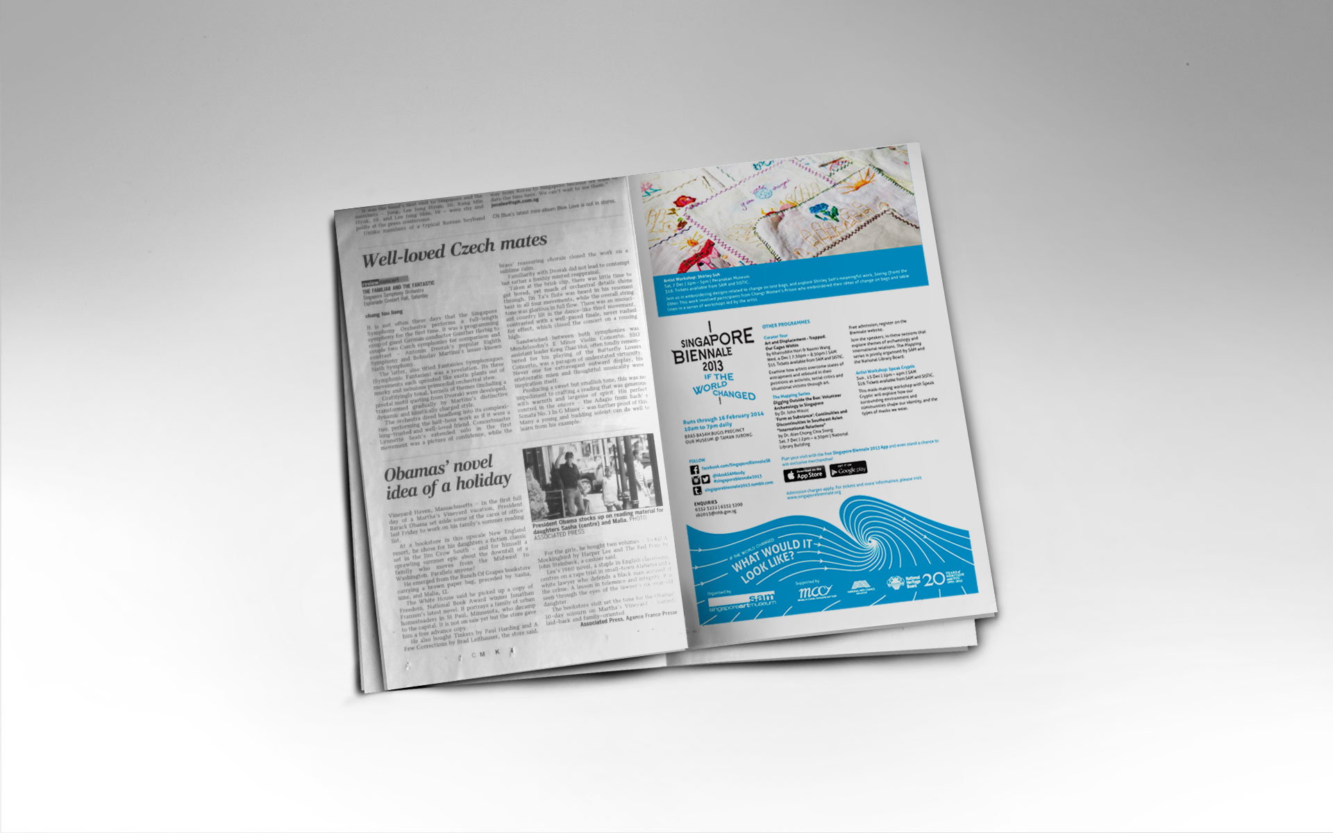
Singapore Biennale 2013: Collaterals
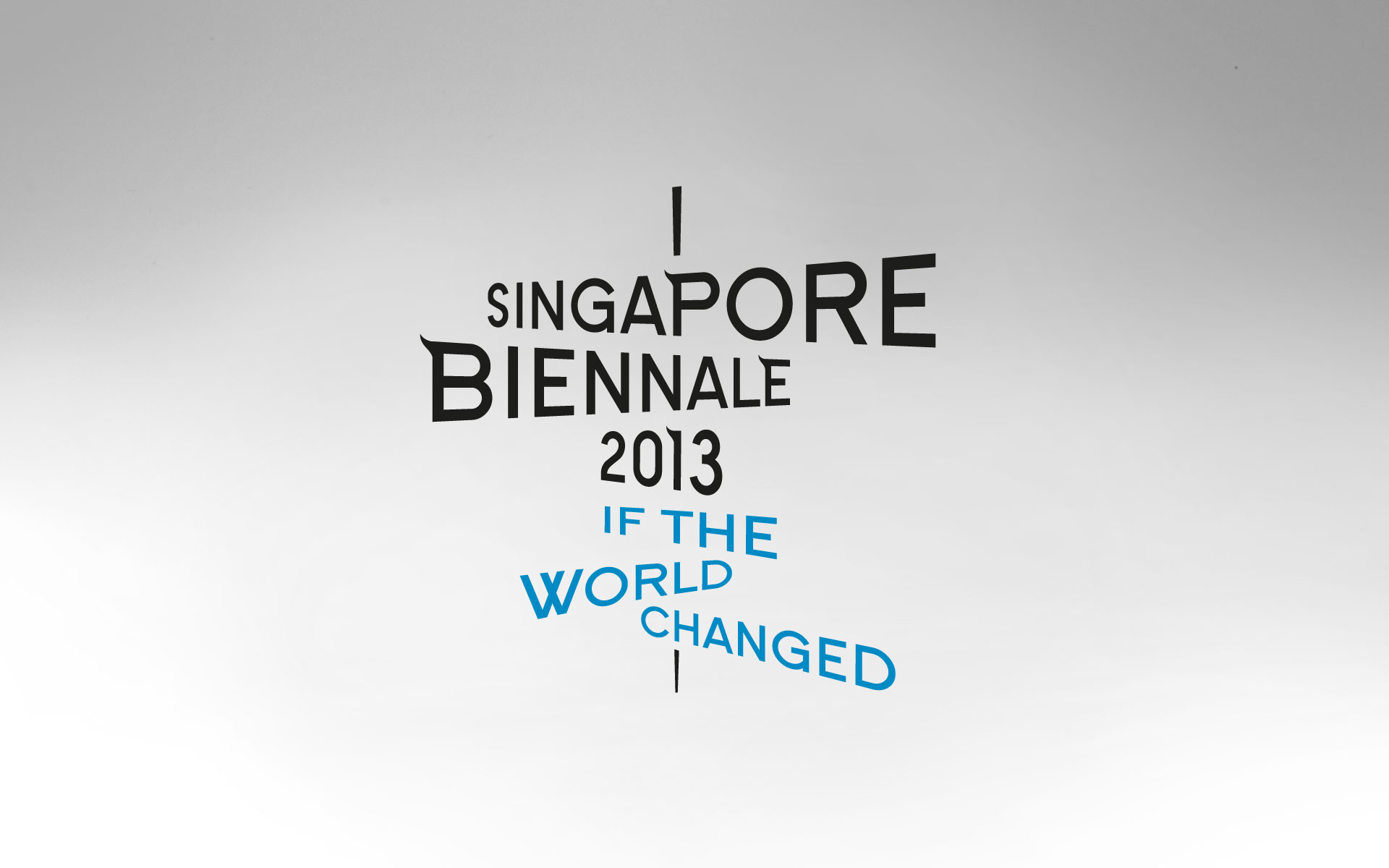
As the pivotal art event in the South East Asian region, the identity of the Singapore Biennale draws from its axial nature. This places Singapore at the centre of the orbit with artists from across the region responding and contributing to the event.
The logo is a wind vane reflecting the title ‘If The World Changed’ and the diverse directions taken by the participating artists. The image of waterways and seas that have historically connected and built South East Asian civilisations influenced the choice of blue. The bold and dynamic typeface features subtle references to Asian rooftops in the arced edges of certain letters.
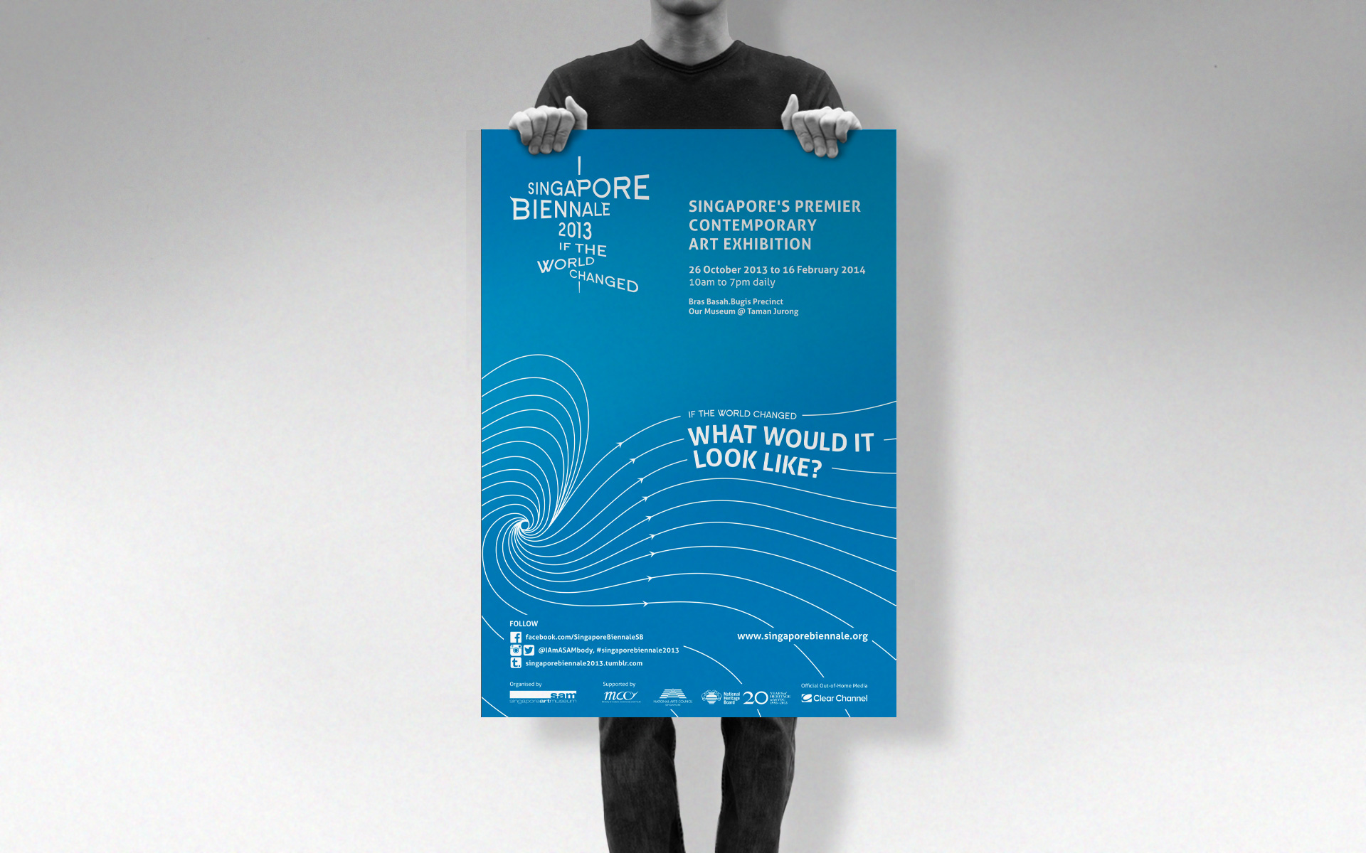
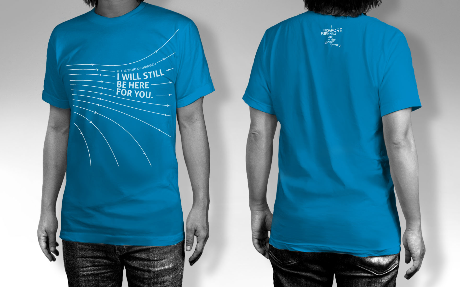
The design of the collaterals reflects the identity’s nature drawing on wind direction patterns and variability to create a cohesive entity.
Client: Affordable Art Fair
Year: 2013
Tap to view full image
