 Tap to view full image
111 Family Office and Foundation
The strategic goal for the 111 Family Office and Foundation visual identity was to convey trust, credibility, and structural support. The foundation’s work in providing resources for family investments and trusts required a visual language rooted in authority and discretion.
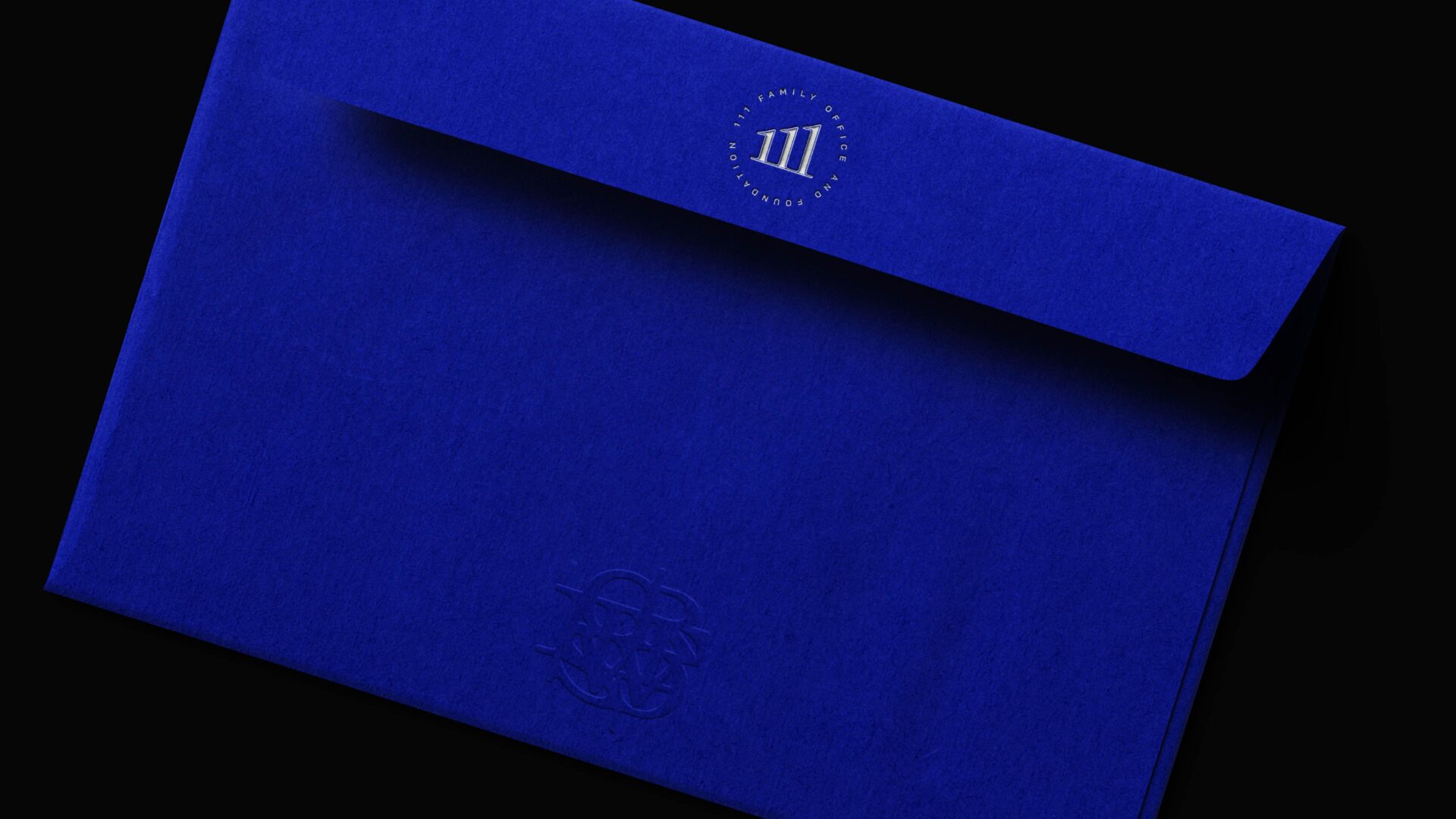
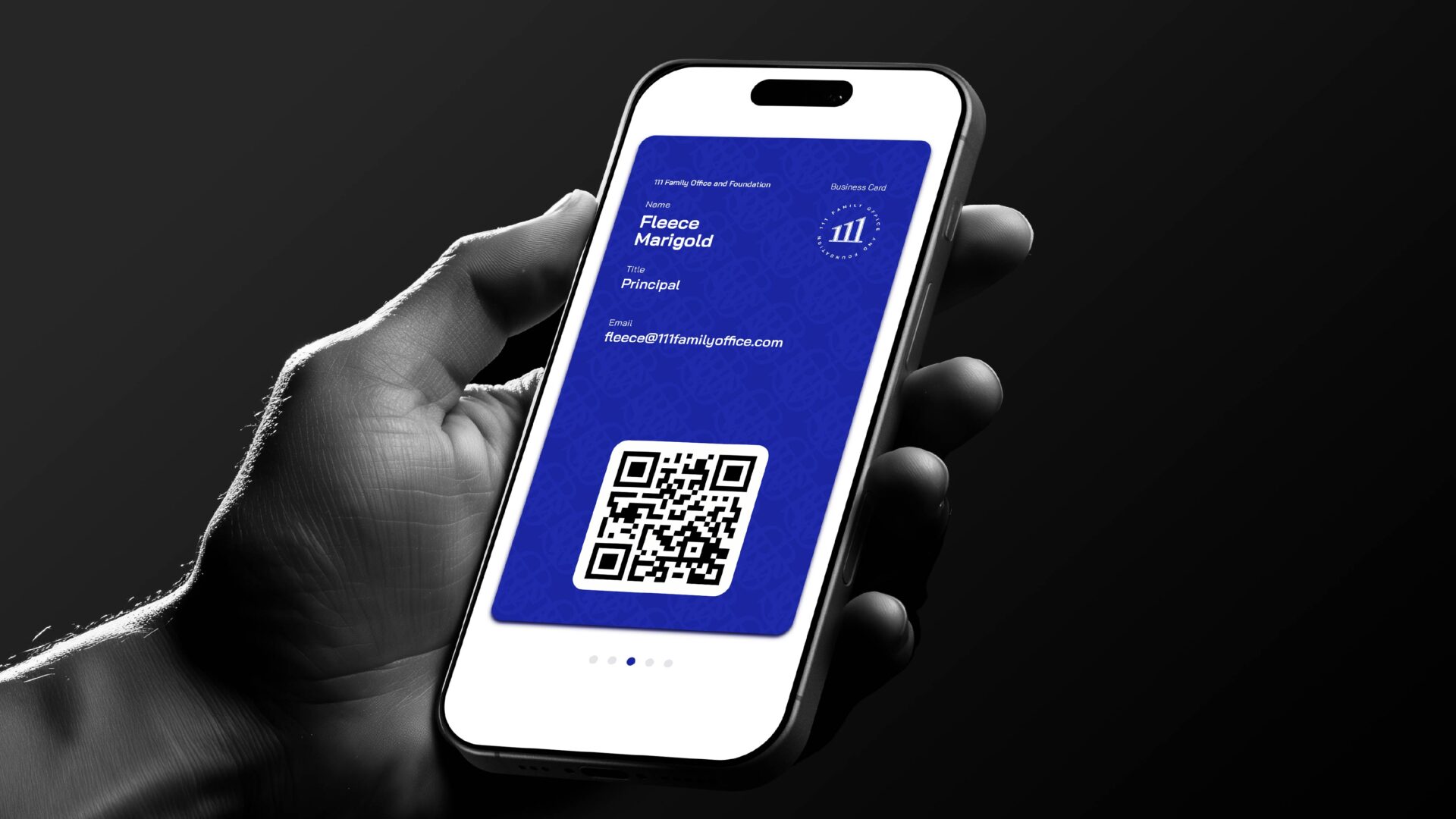
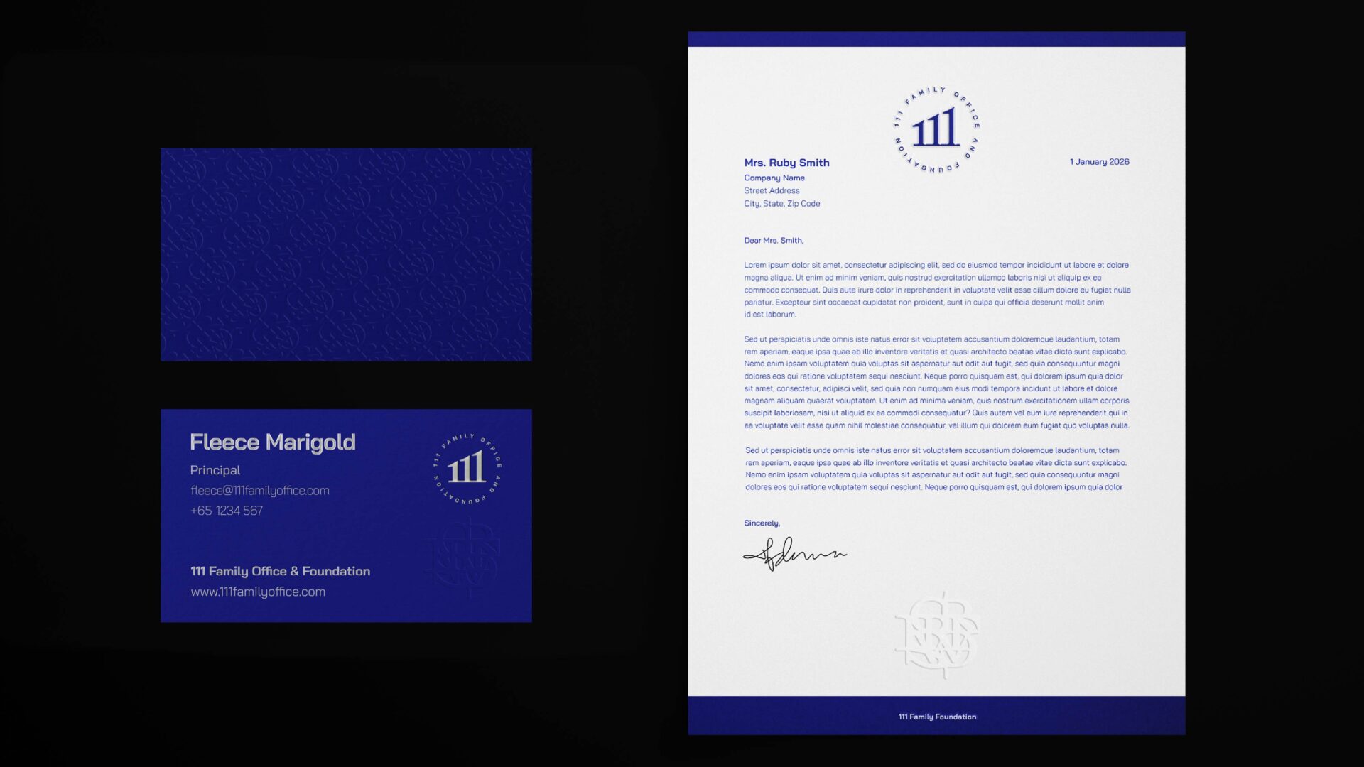
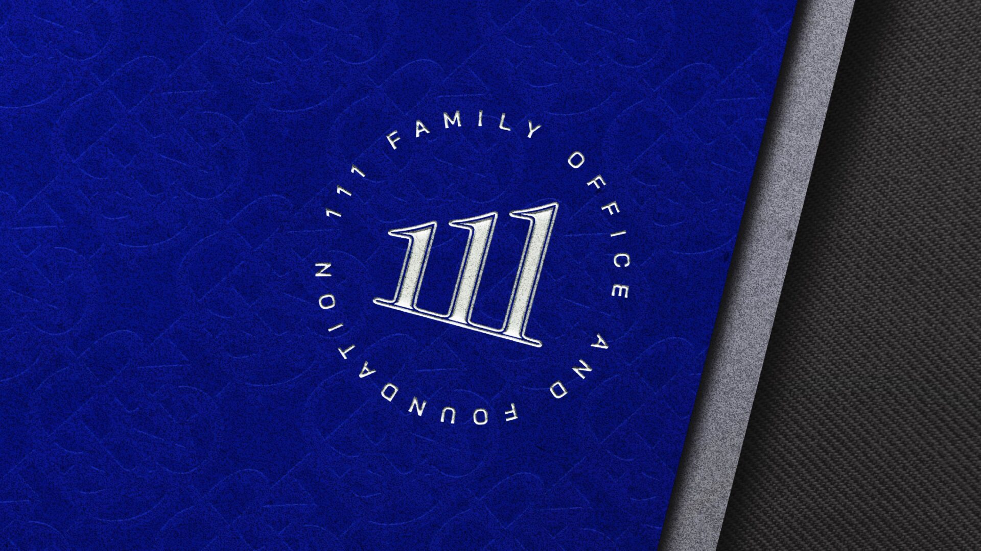
The core of the identity is a bespoke wordmark designed to function like a stamp or a seal, immediately establishing a sense of reliability. Within this architectural mark, the numeral “111” is rendered in an ascending formation, creating a visual slant that represents the growth of the resources the foundation provides. The numerals themselves are structured to appear as pillars, signifying foundational support for the communities served.
An elegant serif typeface was selected to reflect the family heritage integral to the foundation’s history. The primary color palette—a rich navy blue and a clean white—was chosen to reinforce the core brand attributes of trustworthiness, prestige, and transparency.
The identity’s principles were extended to the brand collateral, most notably the business cards. A selection of fine, heavyweight paper stock provides a tactile sense of substance and quality. We employed specialized finishing techniques to translate the brand’s core attributes into a physical form. The wordmark is rendered with a precise foil stamp, while the sigil is applied as a blind emboss, creating a subtle, tangible impression that reinforces the themes of discretion and prestige.
To complete the system, we developed a discrete sigil composed of custom letterforms. This symbol serves as a subtle, internal signifier of the foundation’s purpose. Its application across brand collateral is intentionally understated, creating a layer of communication recognizable only to those affiliated with the foundation, thereby reinforcing the private and trusted nature of their work.
Client: 111 Family Foundation
Year: 2025
Tap to view full image
