 Tap to view full image
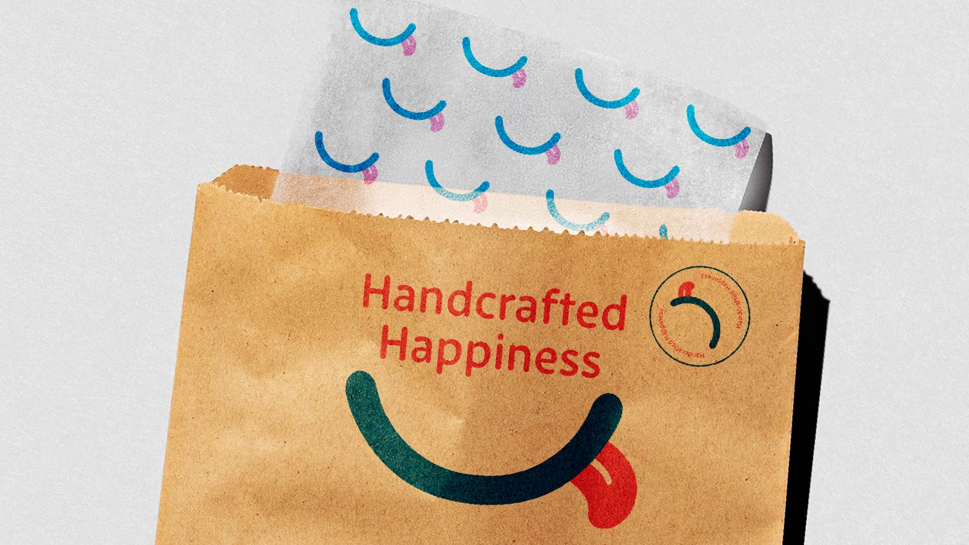
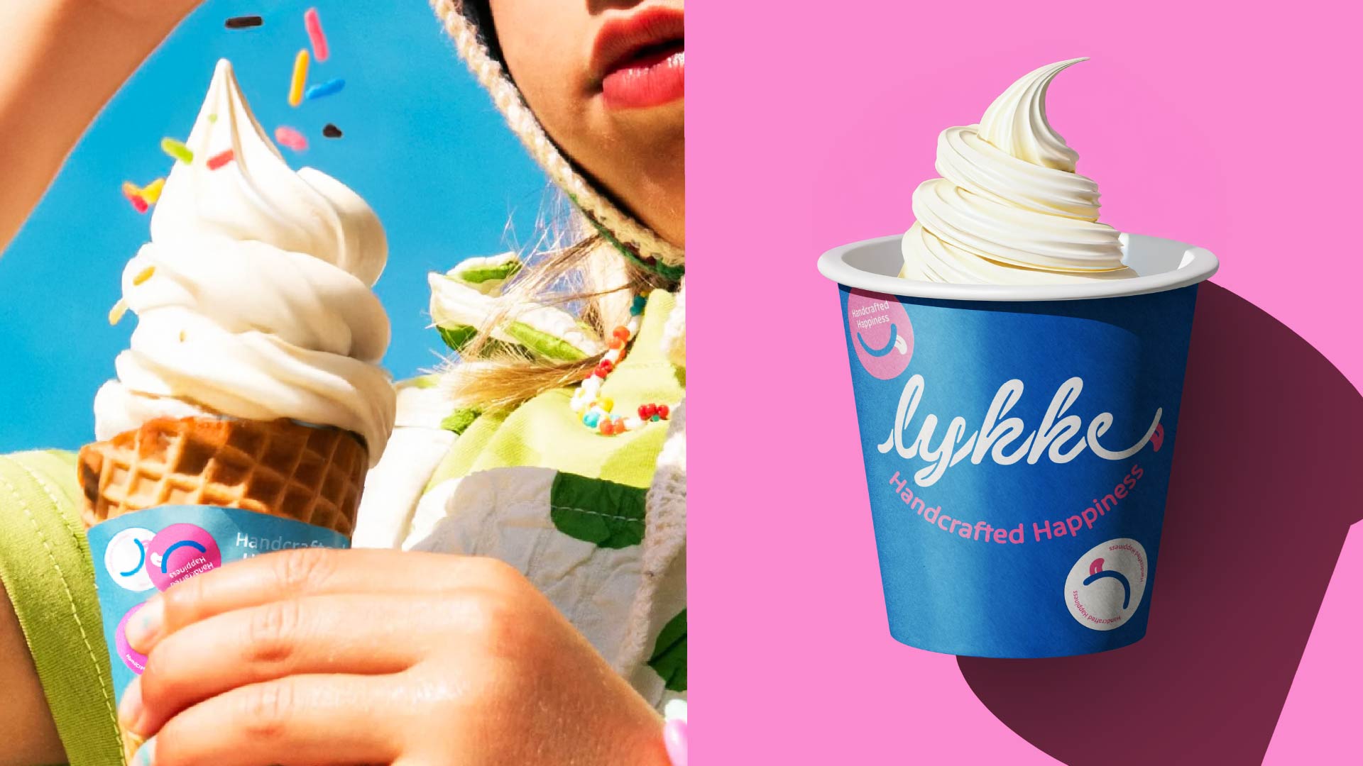
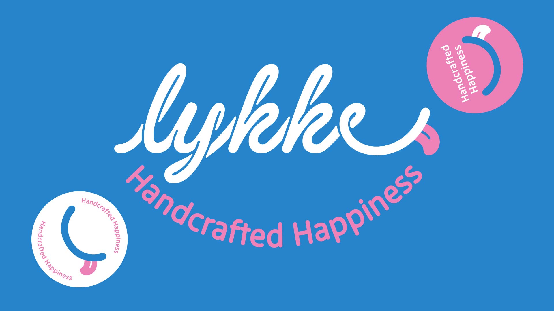
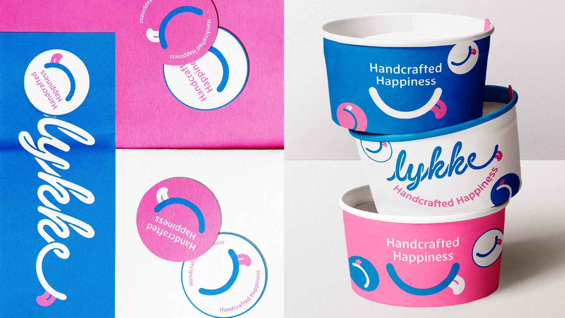
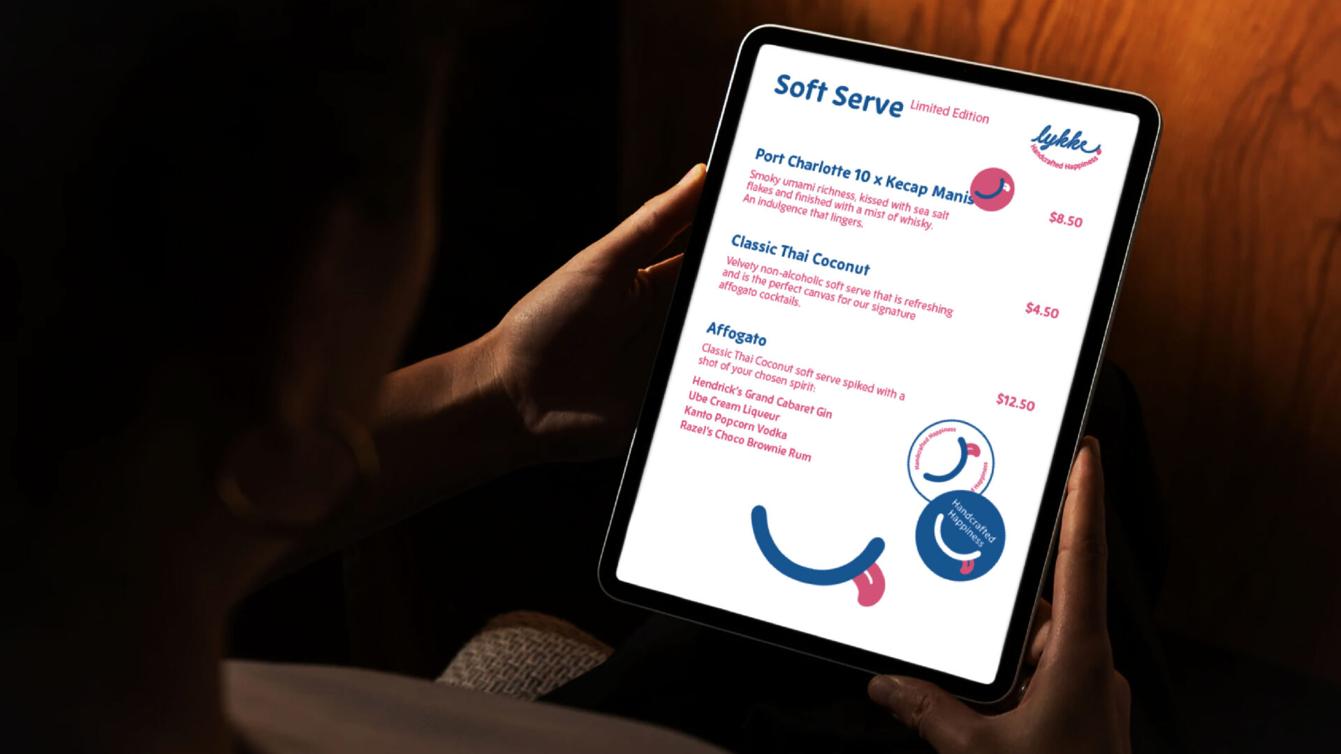
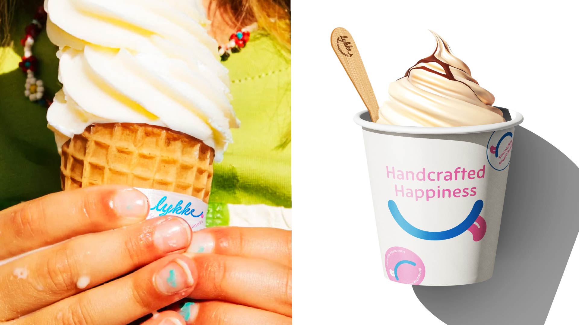
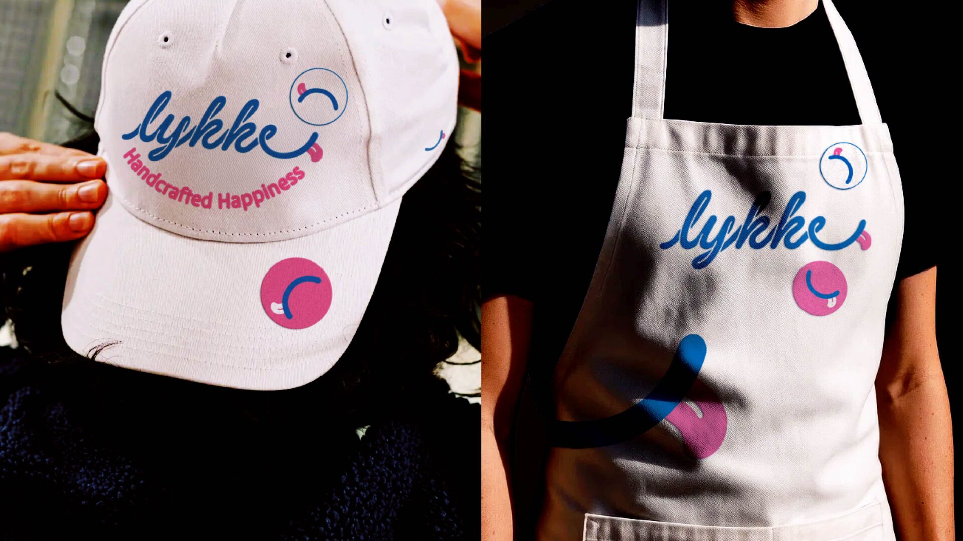
Lykke
Lykke is a homegrown soft-serve brand with a modern twist on local flavours.
Reflecting the soft and light qualities of soft-serve ice cream, Lykke’s wordmark mirrors its texture by featuring distinct round twists and swirls in its typography.
The word Lykke, meaning joy and happiness, is reflected in the long curve at the end of the letter ‘e’. This curve symbolises a smile and serves as a visual element of the identity. A playful illustration of a tongue is incorporated at the end of the wordmark. This is inspired by the pronunciation of Lykke which sounds like “Licky”.
The core colour palette consists of white and blue, inspired by the colours of soft-serve, with a splash of bright baby pink.
The identity also features a rounded typeface reflecting the softness of soft-serve ice cream, making the brand feel friendly, youthful, and inviting.
All in all, these distinct elements come together to form a brand identity that is playful and jolly, transporting patrons on a spectacular journey through the fun and modern flavours of Lykke.
Client: Lykke
Year: 2025
Tap to view full image
