 Tap to view full image
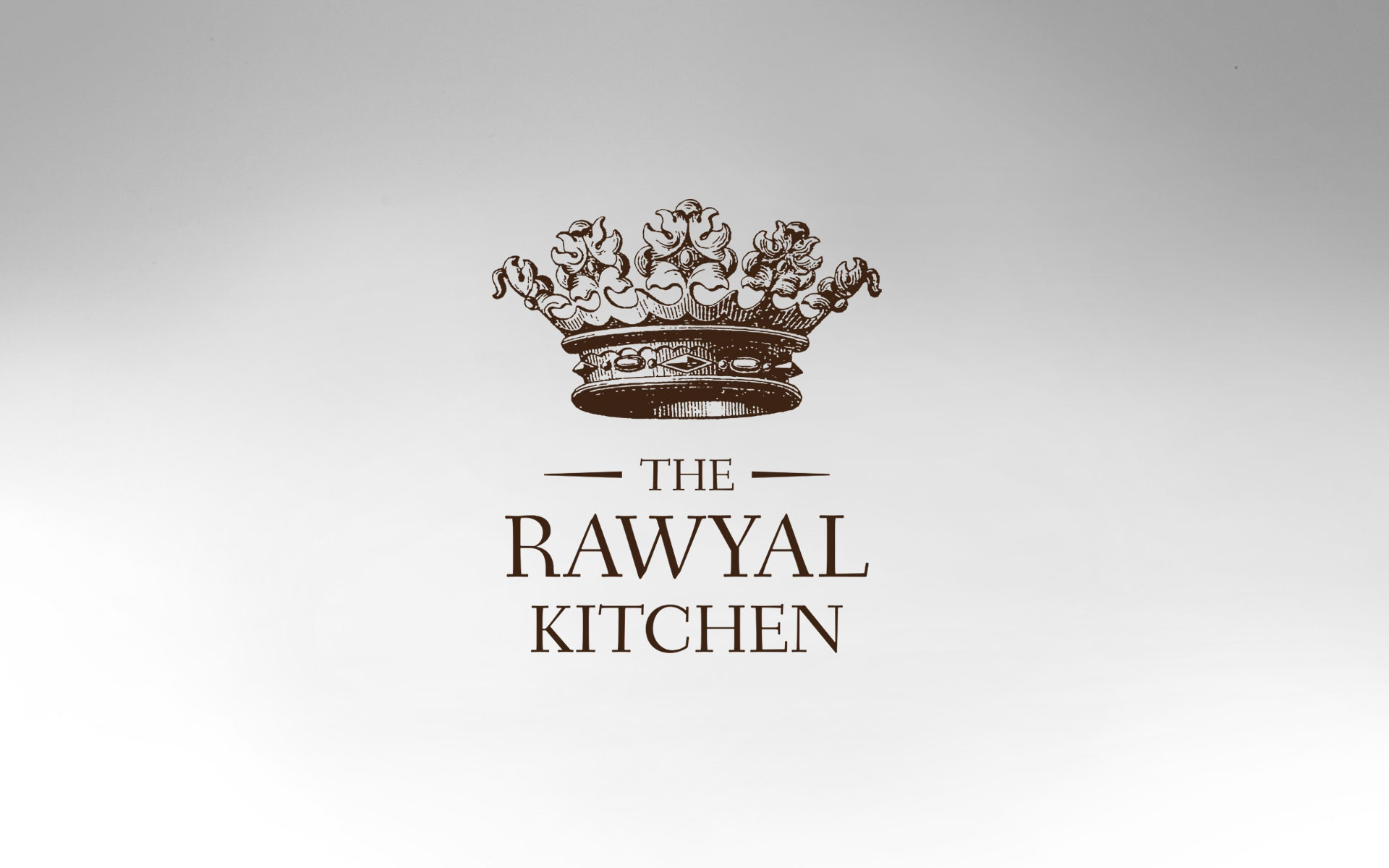
The Rawyal Kitchen
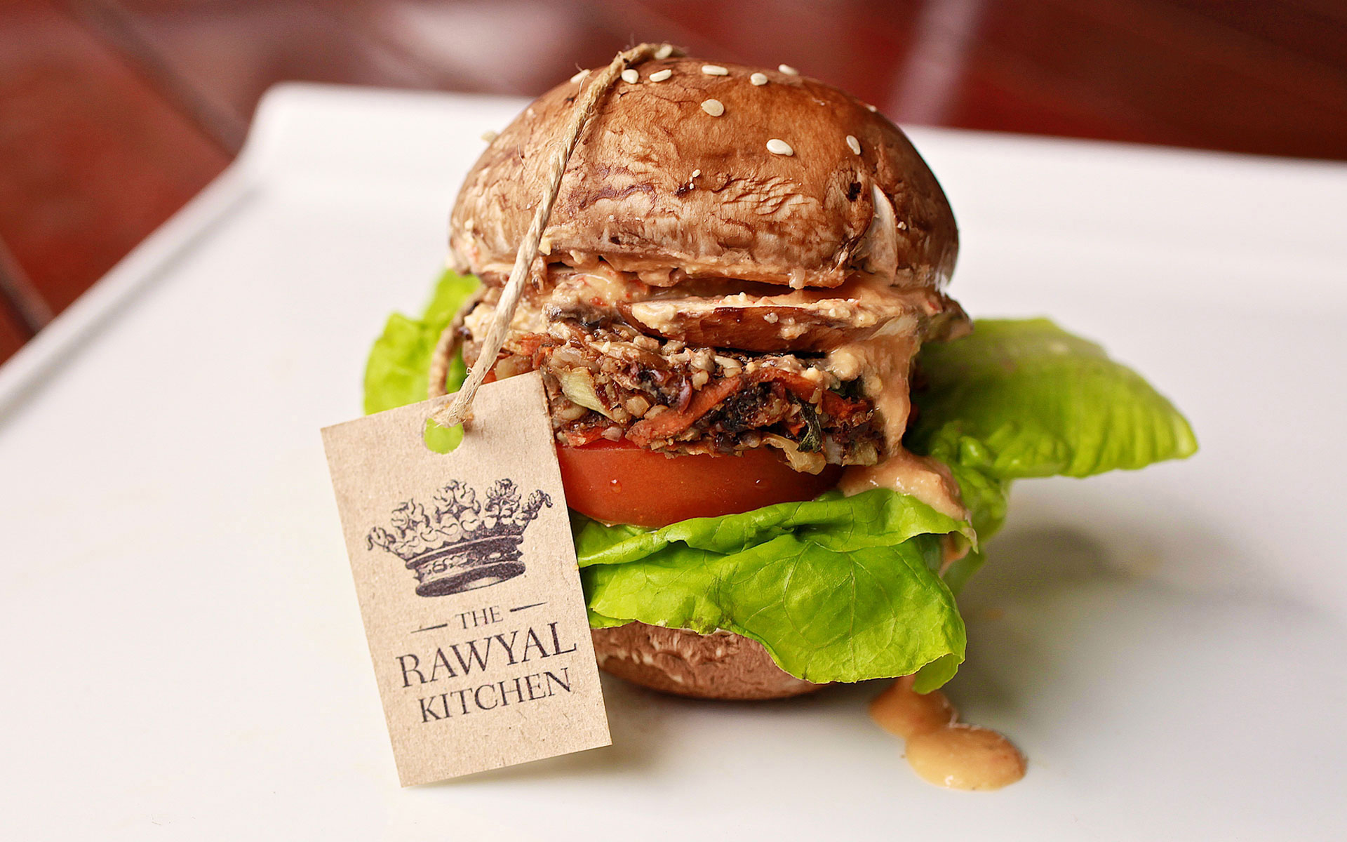
The Rawyal Kitchen provides healthy, gourmet organic raw vegan meals and products all at the click of a button, and also offers classes and demos that educate in leading a healthier, happier and more balanced lifestyle.
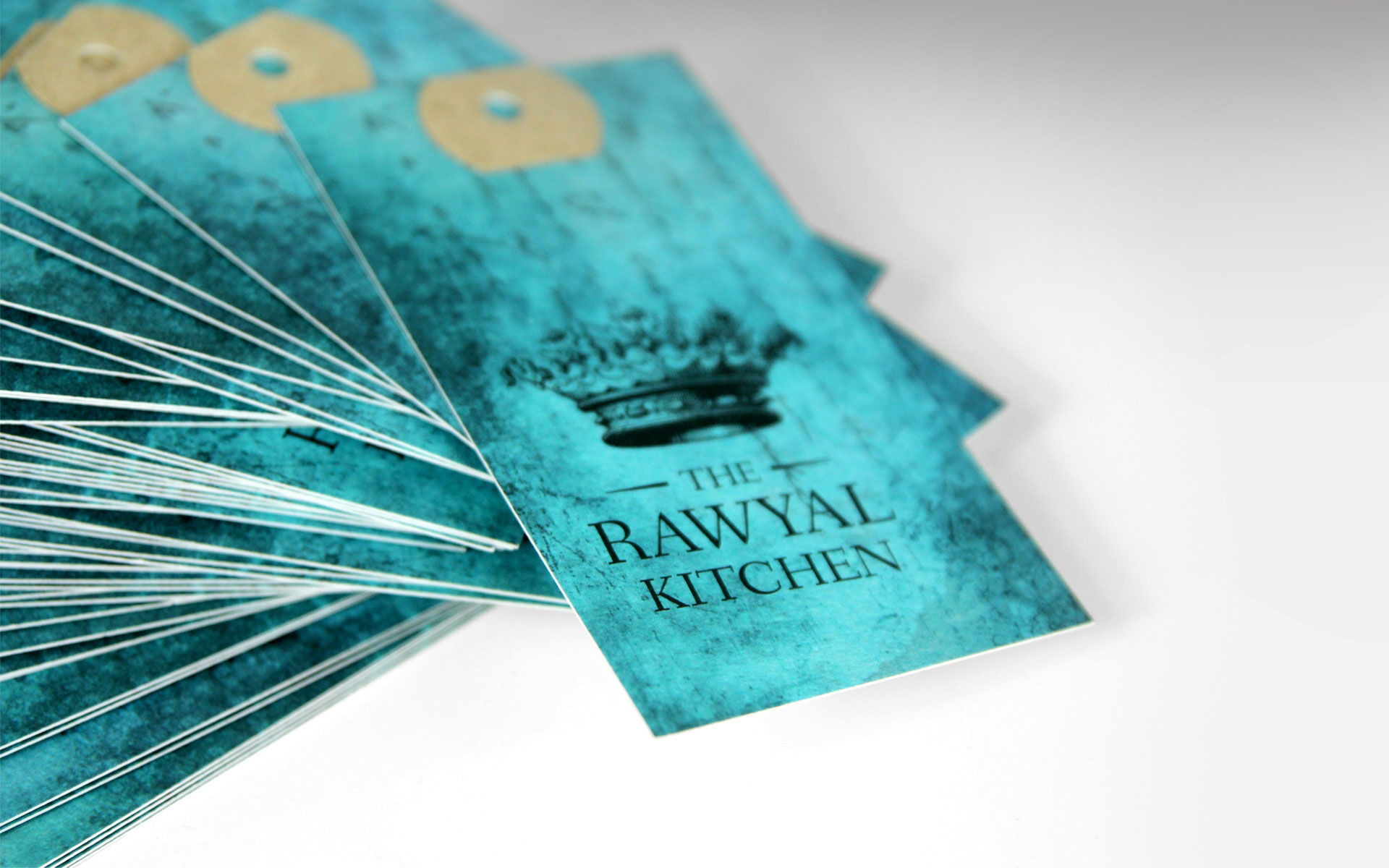
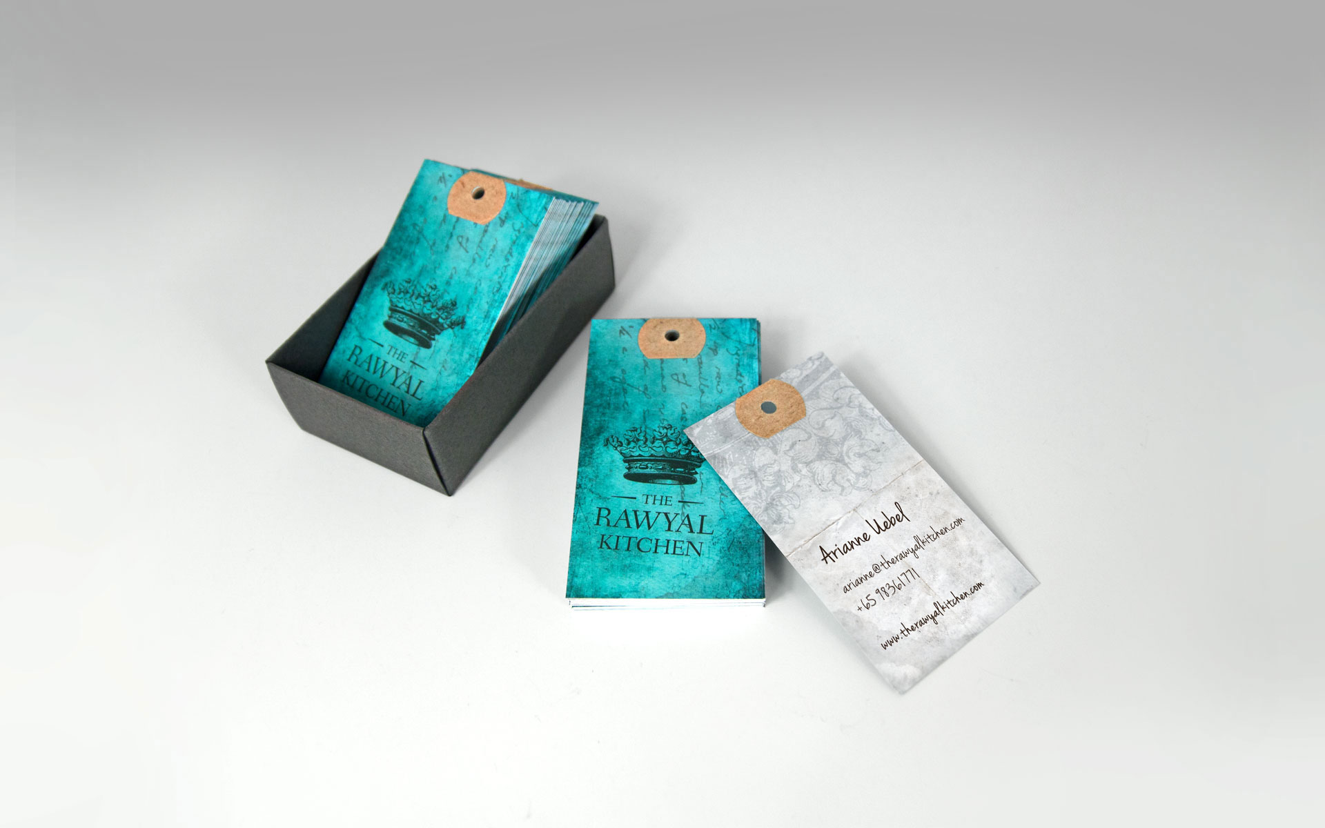
As the brand name is a pun on the word ‘royal’, a crown is incorporated into the logo design. Brown is the primary brand colour as it represents the earth where all raw food goodness come from.
The namecard features a vibrant turquoise colour that brings a freshness to the identity, while the tactile sensation of the finely weaved paper, coupled with a printed texture, augments the handcrafted nature of this business. An ink stamp was also created to mark the identity on other aspects such as labels and packaging that further convey a handmade quality.
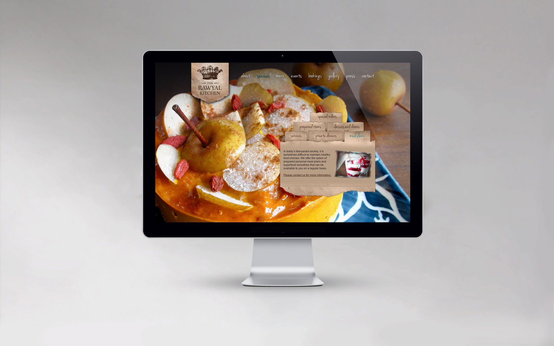
In the website design, the concept of ‘raw’ is taken further with torn paper that act as surfaces for the content, which have been meticulously arranged differently to afford a richer user experience. Most of all, the gorgeous photography shot by the chef, Arianne Uebel, graces the background in fullscreen which makes the website such a drool-worthy sight.
View the website at www.therawyalkitchen.com.
Client: The Rawyal Kitchen
Year: 2012
Tap to view full image