 Tap to view full image
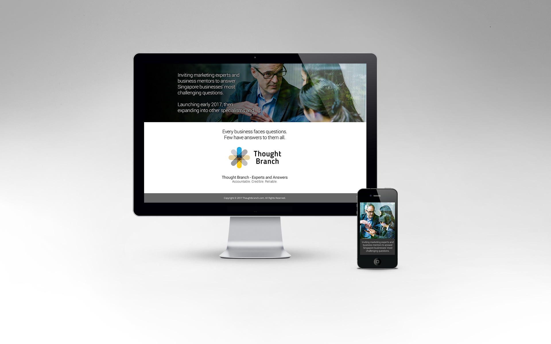
Thought Branch
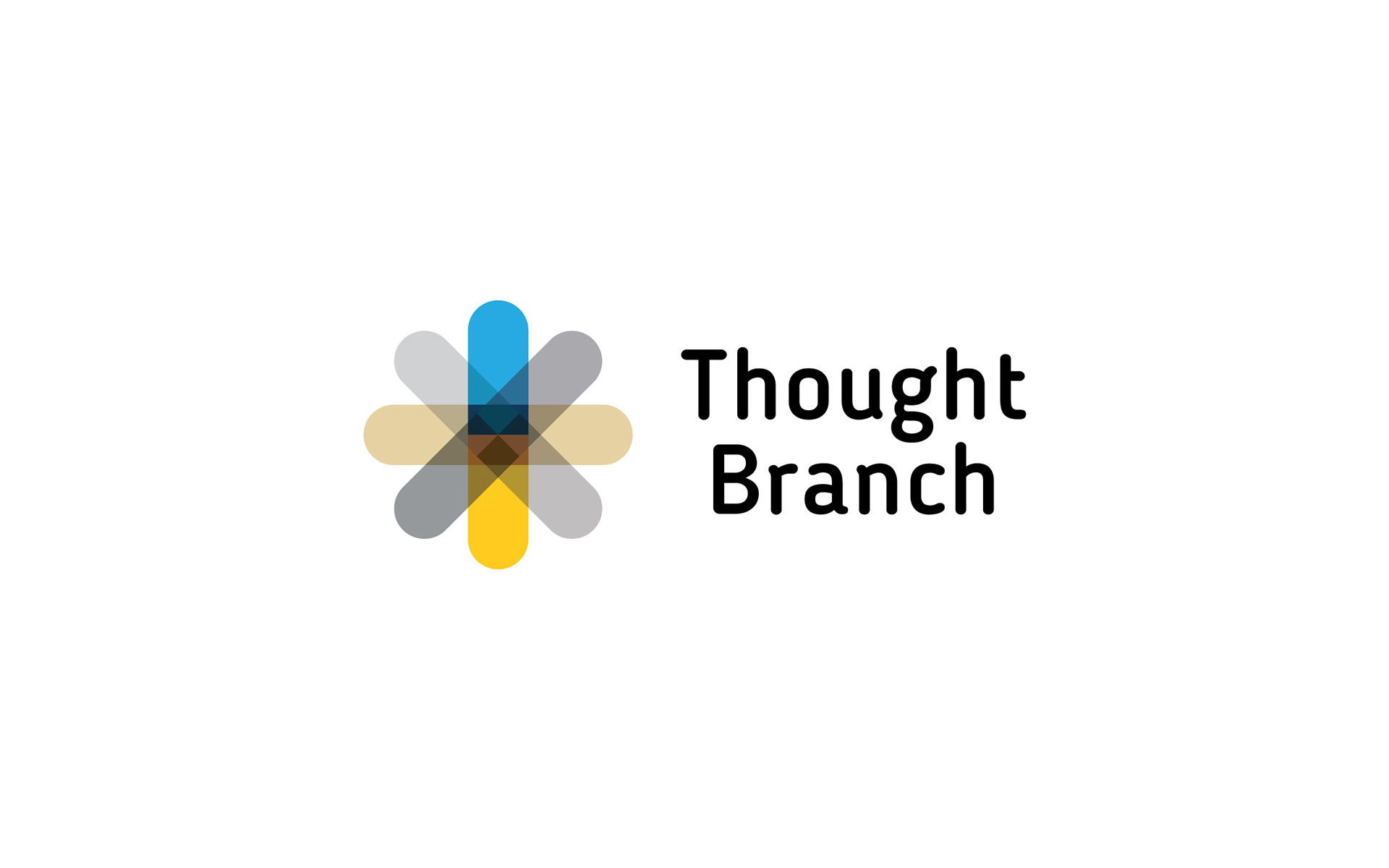
The logo design was developed from the idea of a core (the platform) extending thoughts (branching). It was also of multiplicity where a single strand (the idea) can duplicate and rotate to a larger form, much like how an initial connection between a requestor and an expert can grow to become something more. The resulting image resembles an asterisk, a symbol that is used for annotation, by way of explanation, and to note, which is the essence of giving advice.
The primary colours of blue for dependability, and yellow associated with illumination, were chosen as their values tie to the brand. The secondary colours of grey and brown, both denoting reliability, also relate to a business advice marketplace.
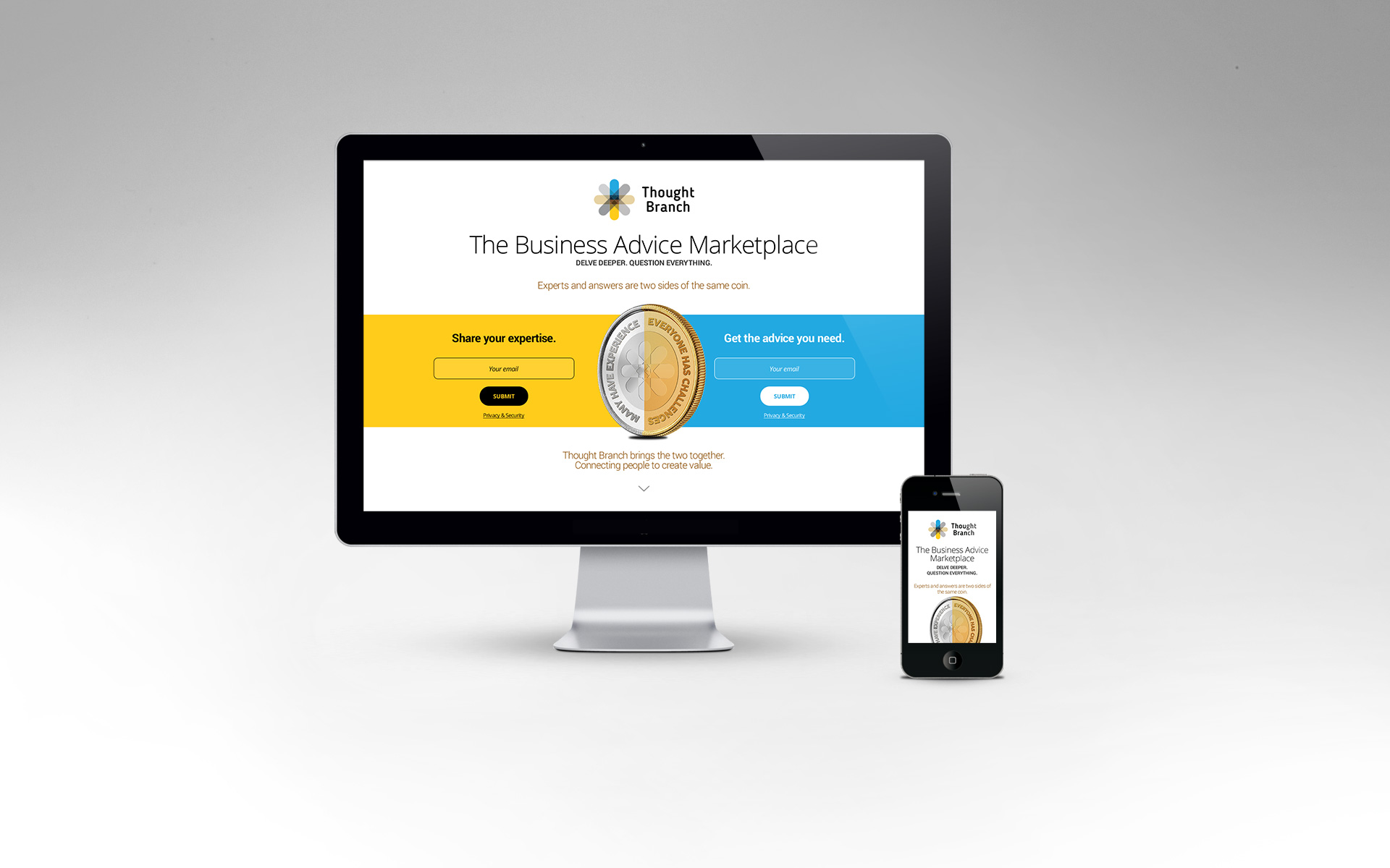
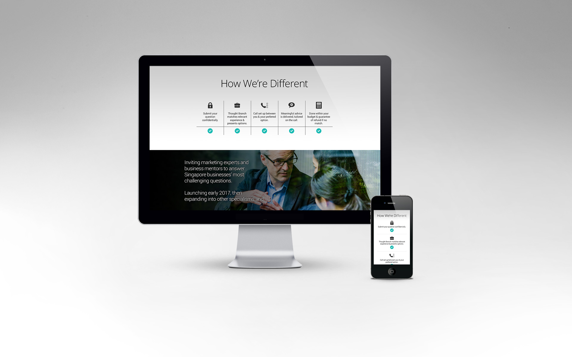
The design of the landing page literally gives a spin on the identity by presenting 2 sides of a coin that encourages experts and answer-seekers to easily join the platform, while presenting details about the marketplace in a clearly demarcated scrolling page.
Proceed to the website here.
Client: Thought Branch
Year: 2016
Tap to view full image
