 Tap to view full image
raiSE Annual Report 2019-2020
The Singapore Centre for Social Enterprise, raiSE is a sector developer and membership body for aspiring and existing social entrepreneurs, and other individuals and organisations that are interested in contributing to the development of the Social Enterprise (SE) sector in Singapore.
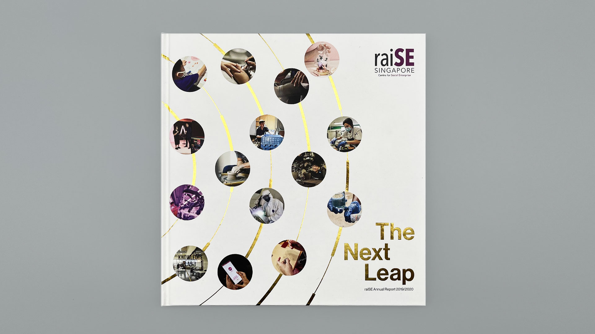
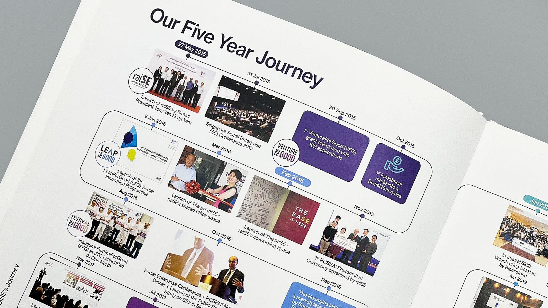
With the annual report for 2019/2020 taking a different approach to celebrate 5 years of the raiSE ecosystem through a theme of The Next Leap, we proposed a visual identity of radial circles to represent progress.
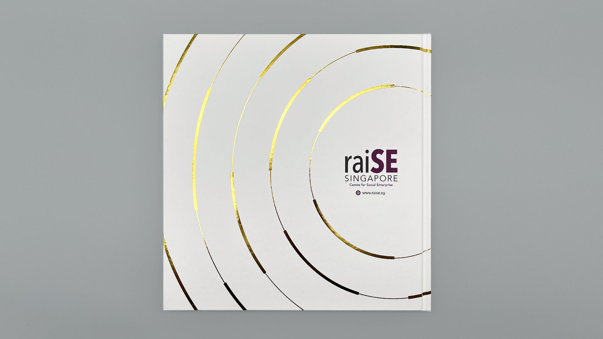
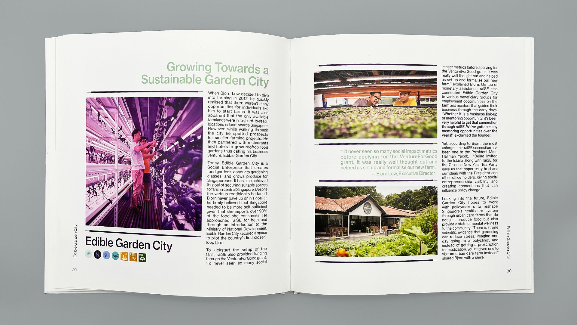
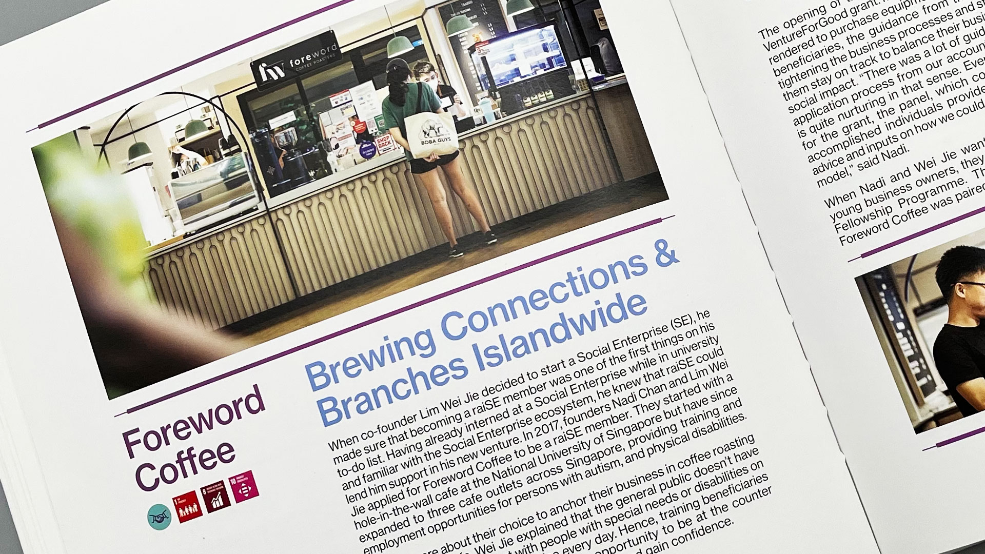
The cover design of the annual report, embellished with gold foil stamping, places the 15 highlighted SEs in orbit with raiSE. Within the content, the circular graphic system is applied to infographics. Varying line thickness of the circles are extracted to form page design elements.
Extending from raiSE’s corporate purple colours, a secondary palette of cool tones from blue to green was established to segment content and afford an approachability that compliments the organisation.
To find out more about raiSE, visit www.raise.sg.
Client: raiSE
Year: 2020
Tap to view full image