 Tap to view full image
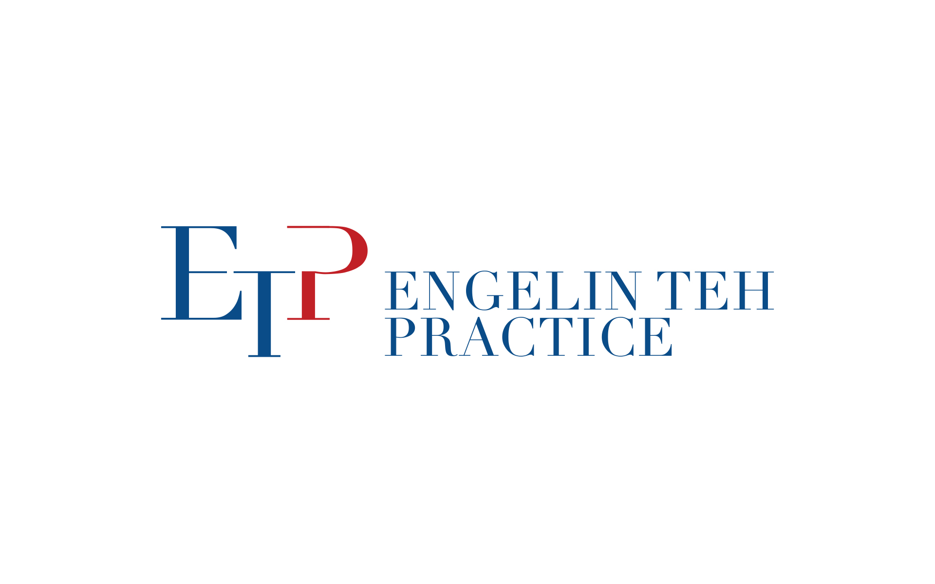
Engelin Teh Practice
Making it on the list of “Best Singapore Law Firms 2021” in the Straits Times is a big achievement, so the partners at Engelin Teh Practice reckoned it was a good time to look into rebranding their image.
Their existing logo was simply a script typeface of the founder’s name but the practice has evolved over 20 years, with other partners coming on board and their practice areas expanded. So it was high time for an update.
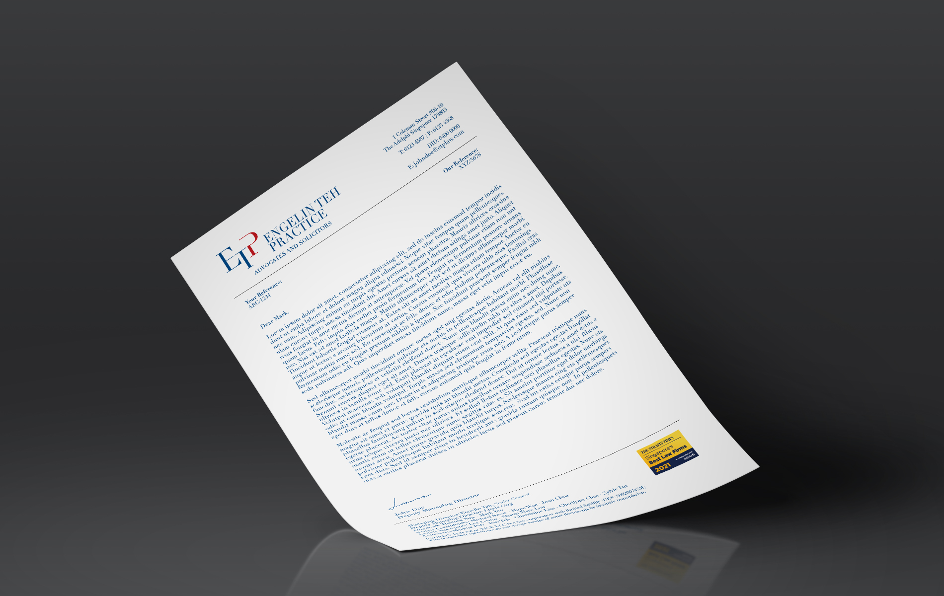
Retaining the company name in the logo was essential for continuity in public recognition, while the addition of a monogram enables ease of remembrance and also lends it forward-thinking modernity.
While we desired for the monogram to be minimalistic in design, it was important to convey the nature of the business. With the arrangement of their initials set in an earnest serif typeface, a monogram was created to evoke the Scales of Justice.
The client had expressed a preference for blue and red colours, from which a navy blue was set as the primary colour as blue is associated with trust, confidence and loyalty. Complimenting the blue is a touch of red, which is passionate, energetic and strong; positive associations to be conveyed by the new brand mark.
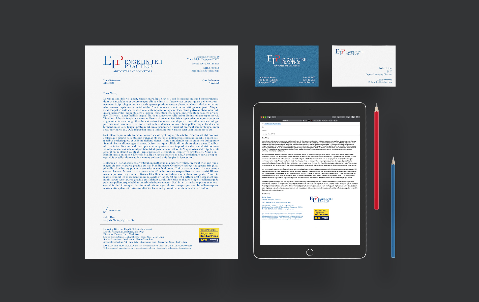
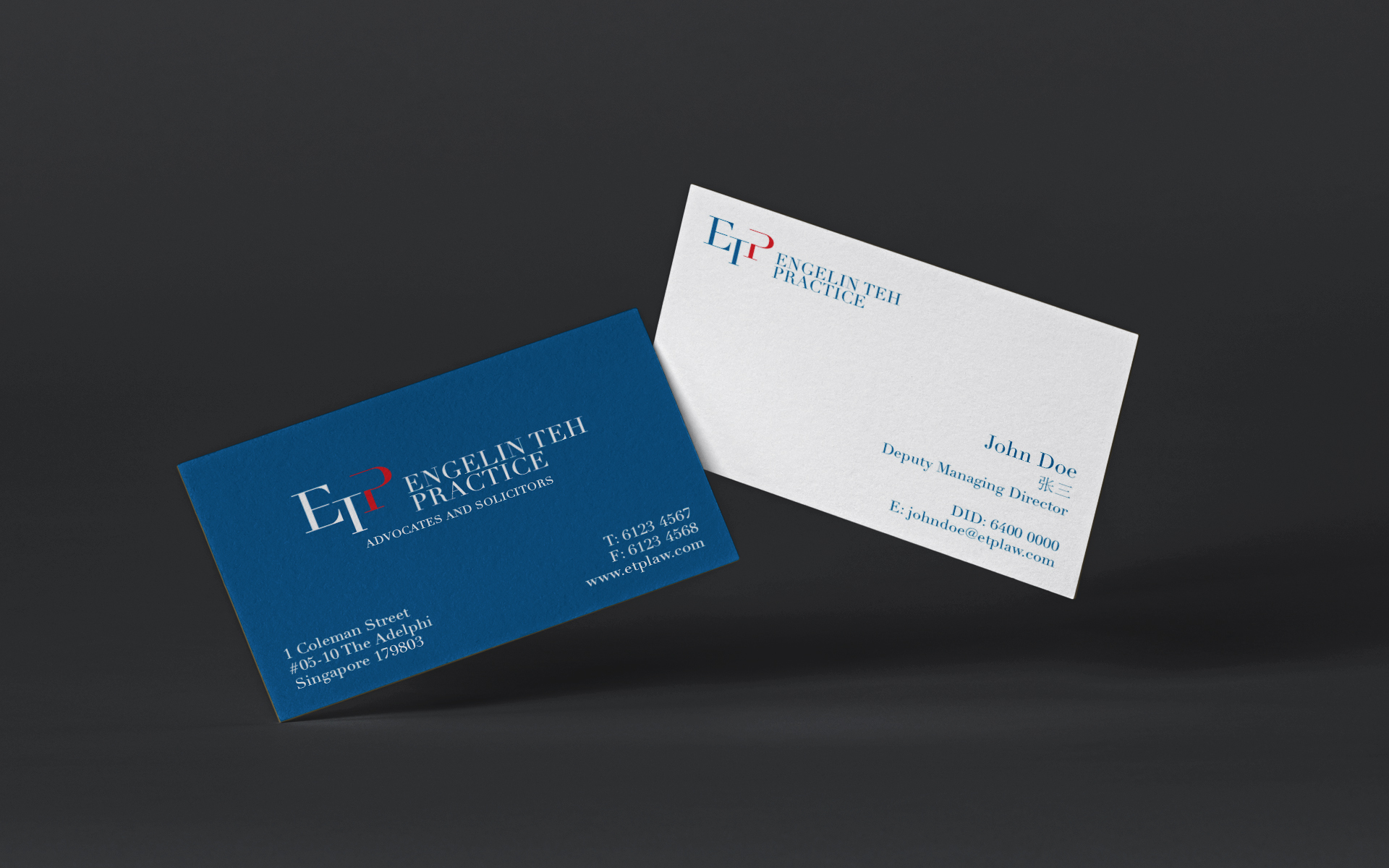
The design of the corporate stationery of Engelin Teh Practice conveys the gravitas of the respectable law firm. Business cards, letterhead and email signatures are dressed in a consistent application of the brand colours of navy blue and red, maintaining an unwavering brand image that speaks of their professionalism and reliability.
Client: Engelin Teh Practice LLC
Year: 2021
Tap to view full image