 Tap to view full image
CultureLink Rebrand
CultureLink is a multi-dimensional arts producing, management and consulting agency based in Singapore, dedicated to connecting inspiring ideas, people, and places across cultures and continents. They engage in creative content design and curation, artist touring and management, festivals and events development, international cultural exchange, advocacy, training and research.
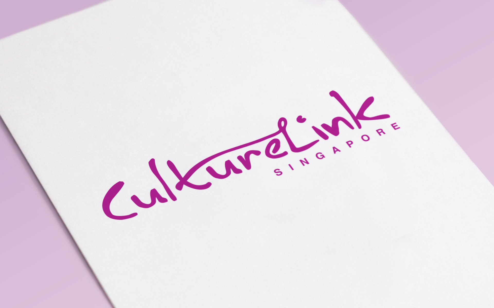
While their original logo had a desirably individualized personality, it was essentially a handwrting typeface, that had legibility and form issues. We zoomed in, modified the letterorms and manually kerned every letter to improve the dynamics and make the logotype more impactful. We then added a stroke that extended from the letter “t” to the letter “L”, building the connector that emphasises their brand name.
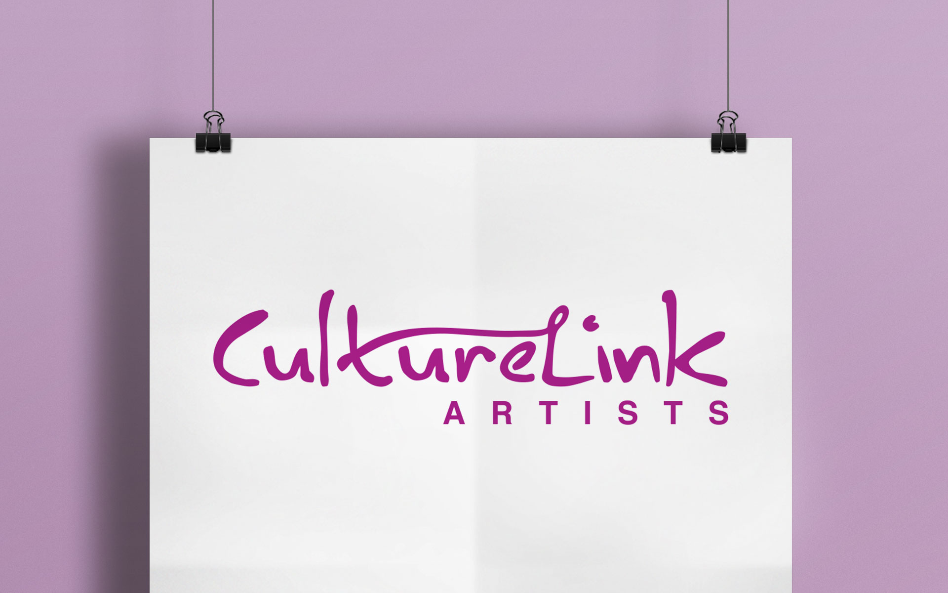
To enable a sense of differentiation to the two sides of their business – arts production/consulting and artist management – a version of the logo was created with the word SINGAPORE replaced by ARTISTS, while maintaining the overall integrity.
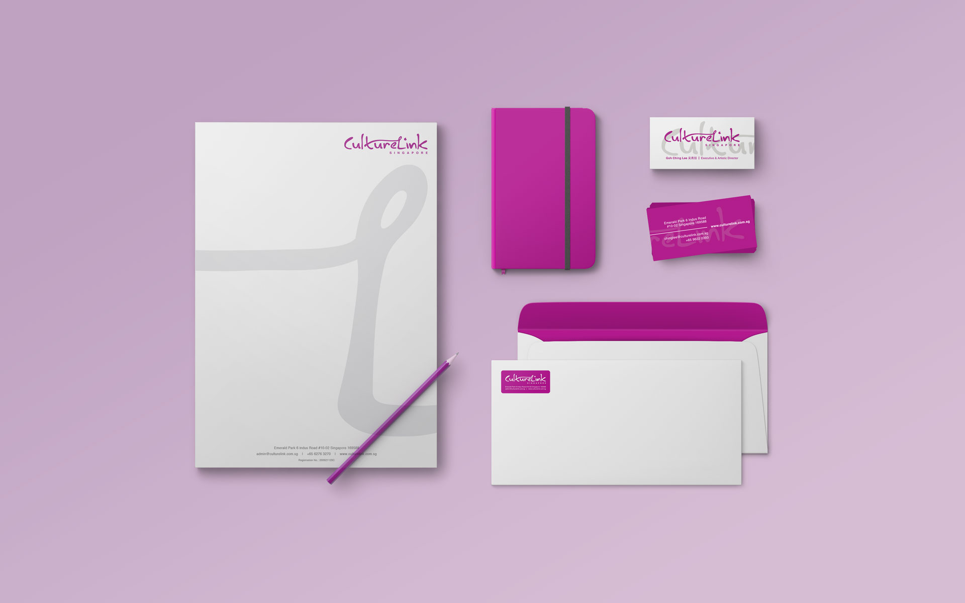
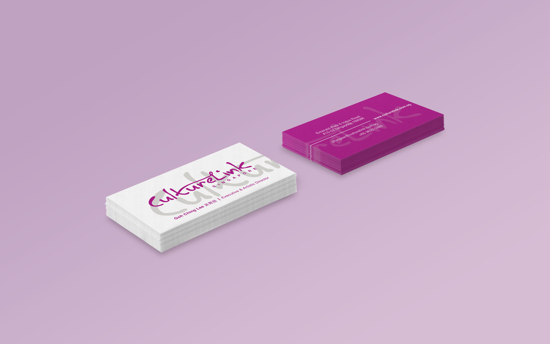
As CultureLink has been established since 2009, there was an established brand recognition of their purple colour, which we decided to play up tmore when we developed the corporate identity system. The namecards were printed on a shimmery Novoluxe Nordic White card while a sticker was created to enable mutliple usage.
For more information on CultureLink, visit here.
Client: CultureLink
Year: 2016
Tap to view full image
