 Tap to view full image
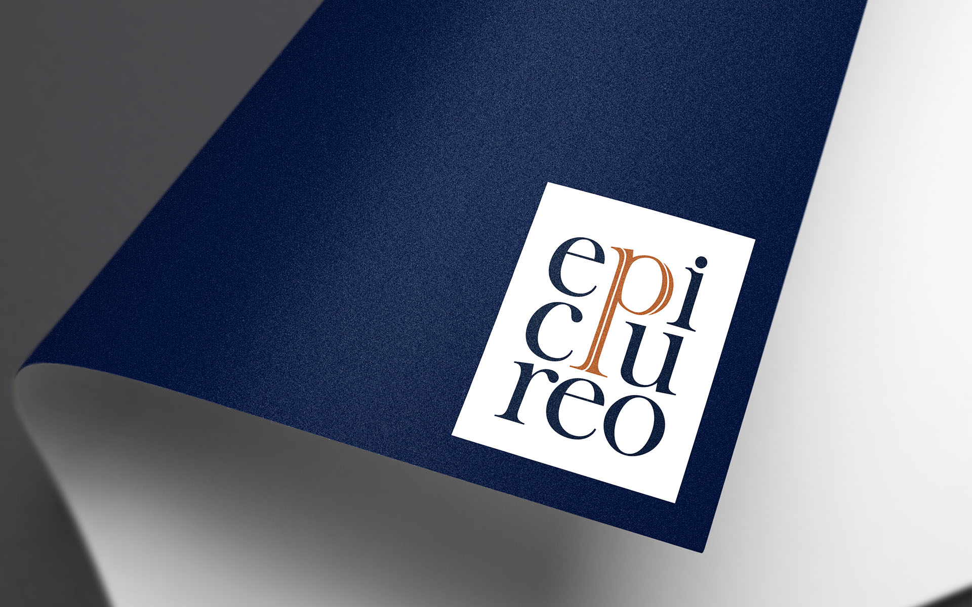
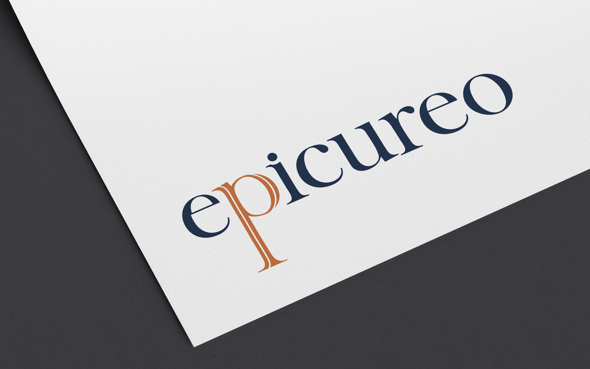
Epicureo
Epicureo is dedicated to exploring the taste of the finest and rarest Cuban rums and as a distributor of these fine spirits, an idenity that represented it’s prestige was developed.
The logo design accentuates the letter “p” as a mark of pleasure define by the rarity of fine tastes, capitalising on the typography of the brand name.
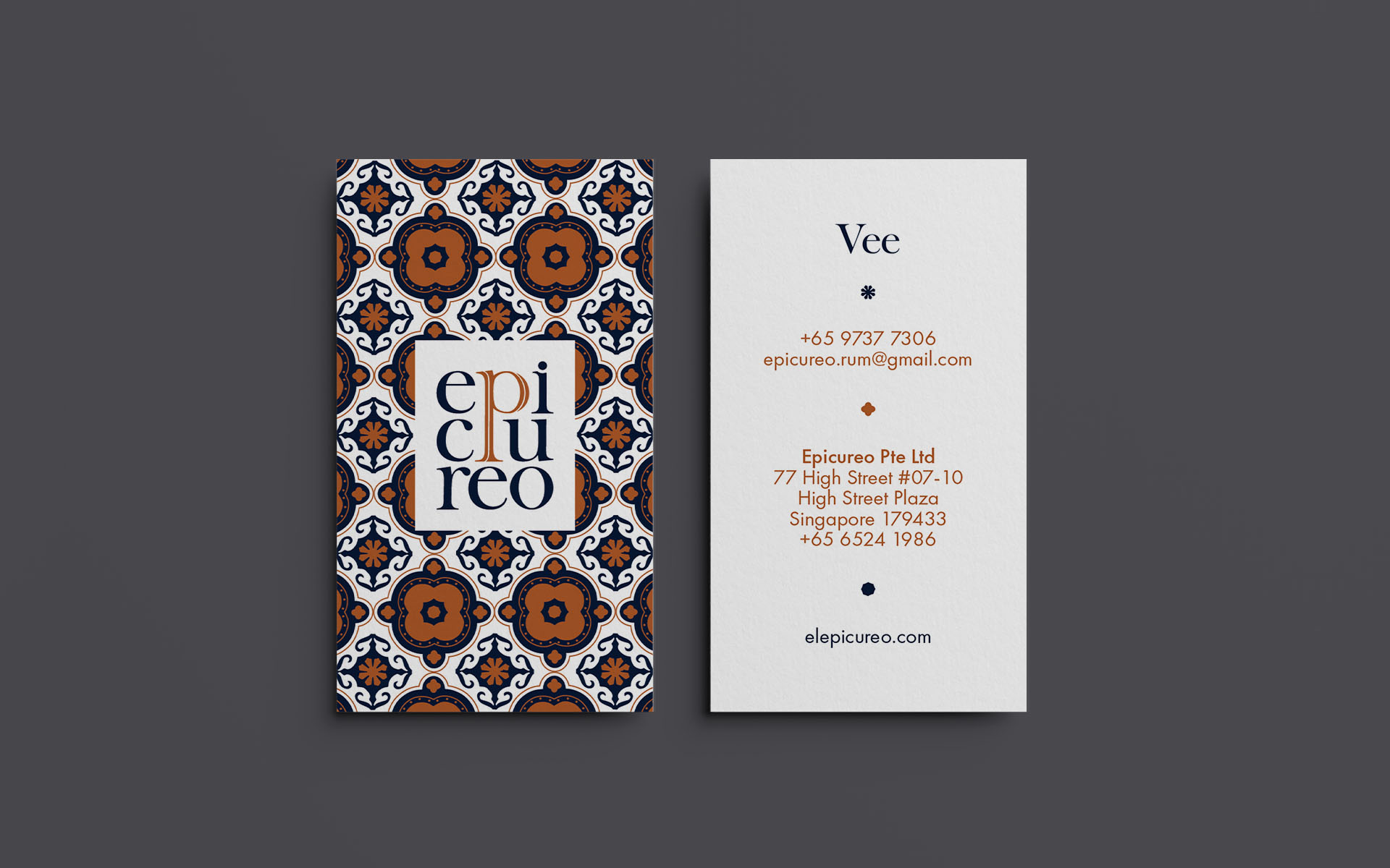
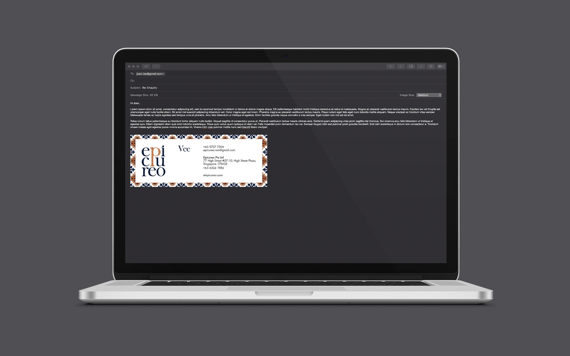
Inspired by Cuban architecture, we took a leaf from the ubiquitous terracotta tile found in the grand old buildings of Havana and created a series of tiles that are used acrossed the corporate stationery.
Colours are earhy with a clay-line feeling in reddish brown that tie back to the colour of rum and a royal blue that connects to the national flag of Cuba.
The consistency of the graphics and colours applied across the identity systems serves to easily associate Epicureo with the best of Cuba.
Client: Epicureo
Year: 2019
Tap to view full image

